The 7 Logo Types: The Art of Logo Design
By Romario Lemon – 14 min read, January 5, 2024

In the ever-evolving landscape of business and branding, a logo stands as the beacon of identity, the visual ambassador of a brand. Did you know that a staggering 90% of consumers believe a strong logo is crucial for brand recognition? In this exploration of the art of logo design, we’ll delve into the seven distinct types of logos, each wielding its own superpower to leave an indelible mark on the canvas of consumer consciousness. So, buckle up as we embark on a journey to unravel the secrets behind the logos that define the faces of our favorite brands!
Here are the 7 types of logos you need to know about:
- Monogram (or lettermark) logos
- Wordmark logos
- Pictorial mark logos
- Abstract logo marks
- Mascot logos
- Combination marks
- Emblem logos
1. Monogram Logos (or Lettermarks)
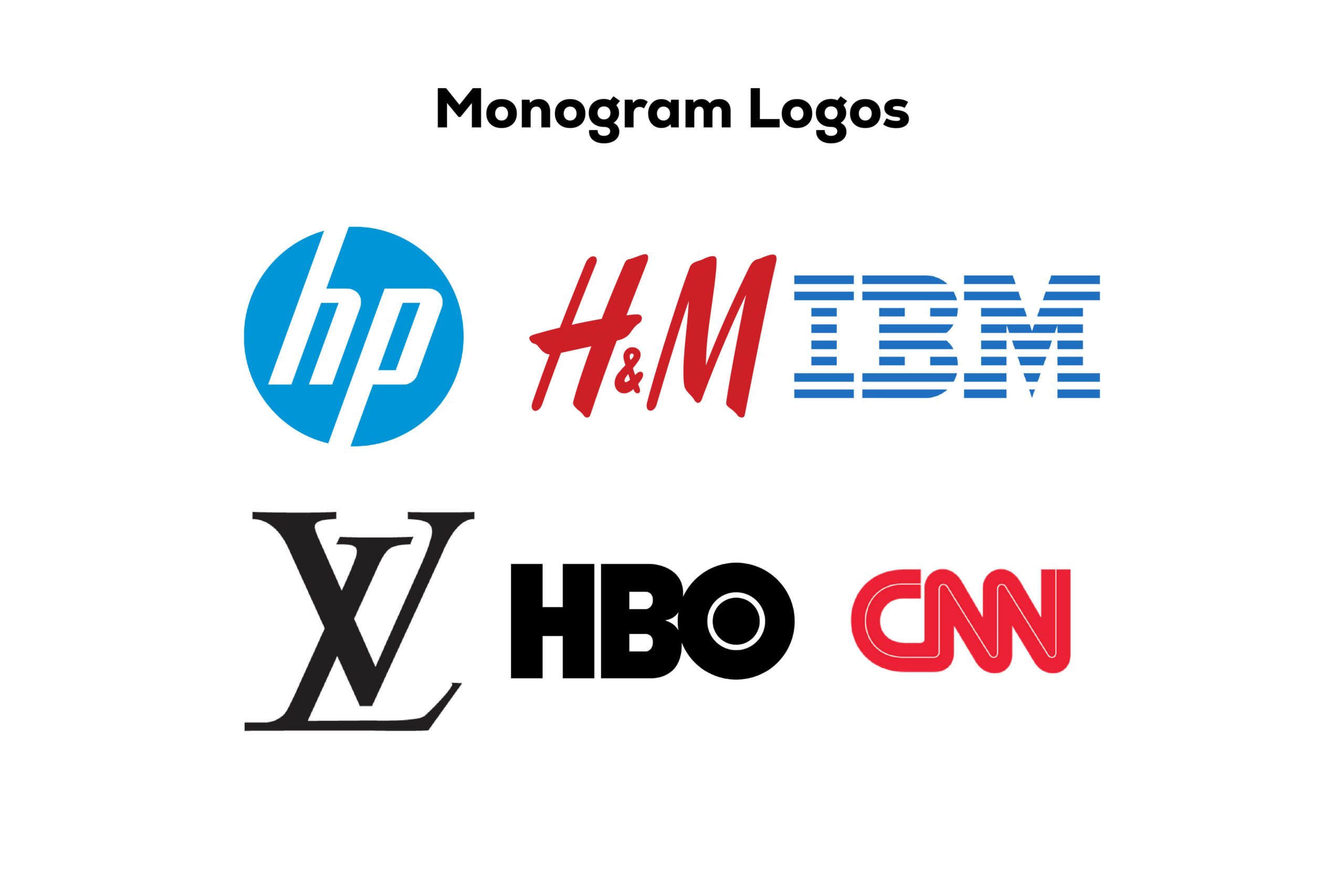
Have you ever wondered about the cool kids of the logo world? Well, meet the monogram logos – the trendsetters who go by their initials. Think IBM, CNN, HP, and HBO. These iconic brands have masterfully transformed their lengthy names into memorable lettermarks. Let’s delve into the fascinating world of monogram logos and discover why they are not just cool but also incredibly effective.
Advantages of Monogram Logos
Simplicity at its Finest
Monogram logos thrive on simplicity. By focusing on a few selected letters, they cut through the noise and deliver a clear, concise message.
A minimalist design ensures that your audience doesn’t get overwhelmed, making it easier for them to remember your brand.
Streamlined Branding for Lengthy Names
Ideal for businesses with long names, monogram logos offer a streamlined solution. They take complex names and distill them into a visually appealing and recognizable symbol.
Consider how NASA’s monogram simplifies the National Aeronautics and Space Administration into a sleek and efficient emblem.
Enhanced Memorability
The simplicity of monogram logos enhances memorability. People are more likely to remember a concise and visually striking symbol, contributing to long-term brand recall.
Disadvantages of Monogram Logos
Initial Recognition Challenges
For new or lesser-known brands, monogram logos might pose initial recognition challenges. Without a strong brand presence, consumers may find it harder to associate the initials with a specific business.
Typography Importance
The choice of font becomes crucial in monogram logos. It should align with your brand’s theme and remain legible across various platforms.
Selecting an inappropriate font may dilute the impact of your monogram and hinder effective communication.
In essence, monogram logos are not just cool; they’re a strategic design choice. Their simplicity and efficiency make them timeless, ensuring that your brand leaves a lasting imprint on the minds of your audience. So, if you’re aiming for a logo that’s sleek, memorable, and effortlessly cool, maybe it’s time to join the monogram club!
2. Wordmarks (or Logotypes)
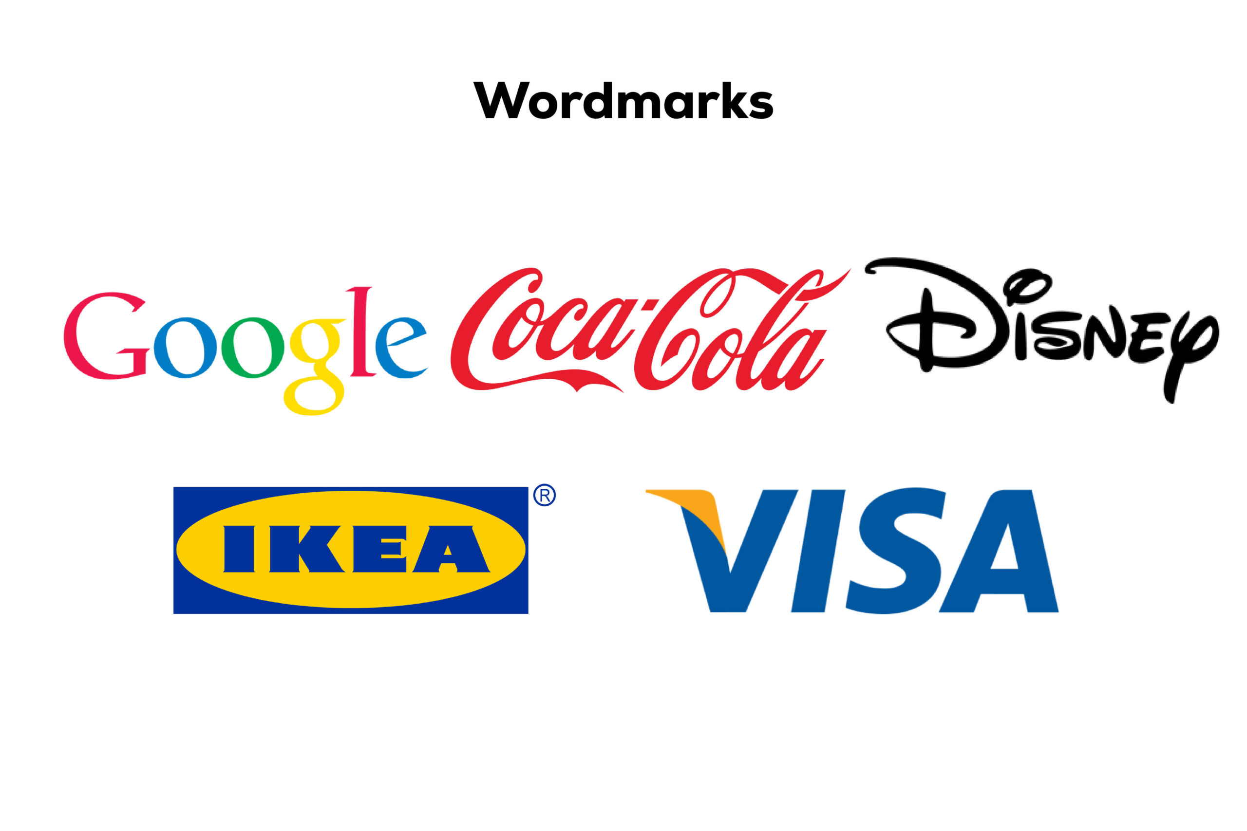
Dive into the realm of wordmarks, where the spotlight shines brightly on your business name. Think Visa and Coca-Cola; they’ve mastered the art of letting the business name take center stage. This logo type is ideal for those with short and sweet names, but there’s more to it than meets the eye. Let’s unravel the nuances of wordmarks, exploring their advantages and considerations.
Advantages of Wordmark Logos
Simplicity in Communication
Wordmarks communicate directly by showcasing the business name. This straightforward approach ensures that your audience immediately associates the logo with your brand.
In a world cluttered with visuals, a wordmark cuts through the noise and delivers a clear message.
Versatility Across Industries
The versatility of wordmarks shines across various industries. From fashion to legal, the font becomes a powerful storyteller, capturing the essence of your business.
Clean and elegant fonts create a sense of luxury for fashion brands, while bold and traditional fonts convey a sense of security for legal or government entities.
Recognition for New Businesses
Wordmark logos are a perfect choice for new businesses. If you’re still establishing your brand, putting your business name front and center helps in building recognition.
Having the brand name as the logo fosters immediate connection and introduces your business to the audience.
Disadvantages of Wordmark Logos
Limitations for Lengthy Brand Names
Wordmarks may not be the best fit for businesses with long names. Trying to incorporate an extensive name into a wordmark can result in a cluttered and less effective design.
The challenge lies in finding a balance between brevity and inclusivity for longer business names.
Font Trends and Maintenance
Staying current with font trends is essential. Wordmark logos, heavily reliant on typography, may need periodic updates to align with evolving design trends.
The font choice should resonate with your target audience and adapt to changing preferences while maintaining the brand’s identity.
Wordmarks are more than just a display of your business name; they’re a strategic choice for effective communication. The interplay of fonts, style, and color creates a visual identity that resonates with your audience. So, if you’re navigating the landscape of logo design and your business name is your pride, a wordmark might just be your perfect fit!
3. Pictorial Marks (or Logo Symbols)
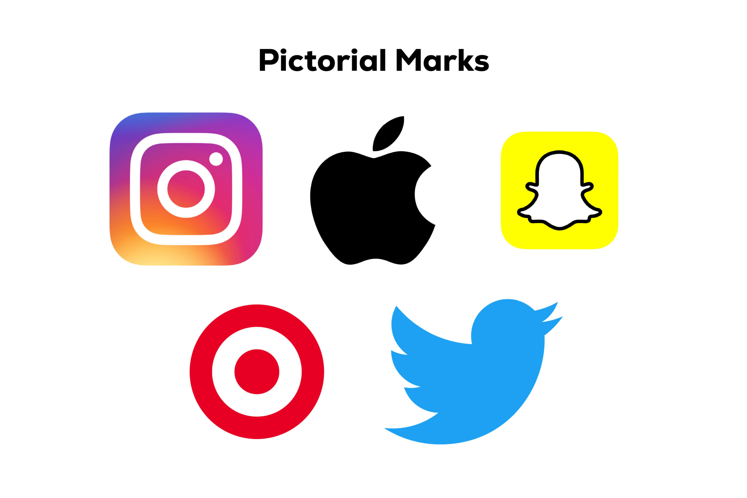
Let’s delve into the world of pictorial marks, often referred to as logo symbols. Think Apple, Twitter, and Target – iconic logos that rely on a single, powerful graphic element. While these symbols deliver instant recognition for established brands, navigating this territory can be tricky for newcomers without a robust brand identity. Let’s explore the nuances, advantages, and potential pitfalls of opting for pictorial marks.
Advantages of Pictorial Marks
Visual Impact and Instant Recognition
Pictorial marks leverage the strength of a single, visually impactful image. The immediate recognition they offer is unparalleled, especially for well-established brands.
The visual simplicity of the symbol creates a lasting imprint in the minds of consumers, fostering brand recall.
Scalability and Adaptability
These logos, often designed as vector graphics, excel in scalability. Whether on a small business card or a massive billboard, the symbol remains clear and recognizable.
The adaptability of pictorial marks makes them a versatile choice for various marketing materials, ensuring consistent branding across platforms.
Conveys Ideas Through Symbolism
Pictorial marks have the unique ability to convey ideas, values, or the essence of a brand through symbolism. The chosen image becomes a visual representation of the brand’s identity.
The symbolism allows for a deeper connection with consumers, as the image communicates on a symbolic and emotional level.
Disadvantages of Pictorial Marks
Challenges for New Businesses
For new businesses or those without strong brand recognition, relying solely on a symbol can be challenging. It may not effectively communicate the brand’s identity to an unfamiliar audience.
Building the necessary association between the symbol and the brand requires time and consistent exposure.
Dependence on Image Associations
The success of a pictorial mark hinges on the associations people make with the image. If cultural or contextual shifts impact these associations, the logo’s effectiveness may be affected.
Unlike wordmarks, which explicitly display the business name, symbols rely on implicit connections that can be subject to interpretation.
Risk of Misinterpretation
Symbolic logos can be prone to misinterpretation, especially if the chosen image is not universally clear in its meaning. Cultural differences or varied perspectives may lead to unintended interpretations.
Ensuring that the chosen symbol aligns with the brand’s intended message requires careful consideration during the design process.
Navigating the landscape of pictorial marks demands a balance between visual impact and strategic communication. While these logos offer unparalleled recognition for established brands, newcomers should tread carefully, considering the potential challenges in conveying a brand’s identity solely through a symbol.
4. Abstract Logo Marks
Abstract marks, a distinctive breed in the realm of logos, unfold like artistic puzzles. Unlike their concrete counterparts, these logos eschew recognizable images, opting instead for abstract geometric forms. Take a moment to envision the iconic BP and Pepsi logos – embodiments of uniqueness and symbolism. Let’s unravel the intricacies of abstract marks, exploring their characteristics, advantages, and potential considerations.
Characteristics of Abstract Marks
Non-Representational Geometry
Abstract marks transcend literal representation, employing geometric shapes that don’t directly mimic tangible objects or concepts.
The emphasis is on creating a visual language through form, inviting interpretation and fostering a deeper connection with the brand.
Symbolic Expression
Rather than relying on familiar images, abstract marks express meaning through symbolism. Shapes, lines, and colours combine to convey the essence and values of the brand.
This symbolic expression allows for a more nuanced and versatile representation, catering to diverse interpretations.
Uniqueness and Memorability
The abstract nature of these logos contributes to their uniqueness. By steering clear of literal associations, brands can craft a visual identity that stands out in the crowded landscape.
Abstract marks have the potential to be highly memorable, as they create a distinctive visual imprint that separates the brand from competitors.
Advantages of Abstract Marks
Versatility in Interpretation
Abstract marks provide room for varied interpretations, allowing different audiences to find personal meaning in the logo.
This versatility can be advantageous in reaching diverse demographics with varying cultural backgrounds and perspectives.
Timeless Aesthetic
The absence of specific, time-bound imagery lends abstract marks a timeless quality. These logos can withstand evolving design trends, ensuring longevity in the brand’s visual identity.
A timeless aesthetic contributes to the logo’s effectiveness over the years, minimizing the need for frequent redesigns.
Distinctive Branding
Brands seeking a distinctive and innovative image can benefit from abstract marks. The unique visual language sets them apart, fostering a sense of brand individuality.
The distinctive nature of these logos contributes to brand recognition, especially as consumers associate the abstract form with the brand’s values.
Considerations for Abstract Marks
Established Brand Recognition
While abstract marks offer versatility, they may be more effective for brands with established recognition. Newer brands might face challenges in conveying identity solely through abstract symbolism.
Building a strong association between the abstract mark and the brand requires consistent exposure and messaging.
Potential for Misinterpretation
The abstract nature leaves room for interpretation, which can be both an advantage and a challenge. Misinterpretation is a risk, especially if the symbolism is not clear or aligned with the brand’s intended message.
Careful consideration during the design process is crucial to ensure that the abstract elements effectively communicate the desired brand narrative.
Abstract marks, with their enigmatic allure, invite brands to communicate through the language of form and symbolism. While they offer versatility and a timeless aesthetic, brands must navigate the balance between abstraction and clarity to create a logo that resonates with their audience.
5. Mascot Logos
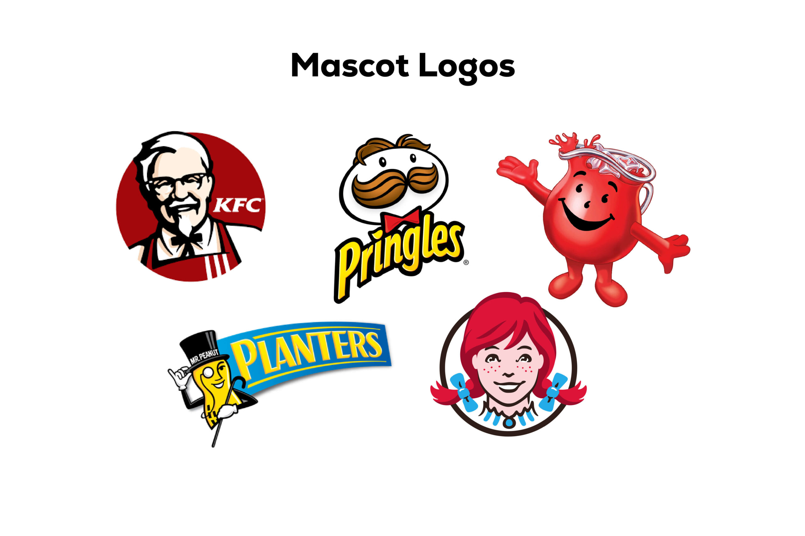
Mascot logos, the lively characters that breathe charm and personality into brands, are the life of the brand party. Picture this – the Kool-Aid Man bursting through walls, KFC’s Colonel with a friendly wave, and Planter’s Mr. Peanut gracing the scene. These iconic mascots aren’t just symbols; they’re brand ambassadors. Let’s dive into the vibrant world of mascot logos, exploring their allure, advantages, and a sprinkle of considerations.
The Allure of Mascot Logos
Personifying the Brand
Mascots go beyond being mere symbols; they personify the brand, becoming its animated representatives. This anthropomorphic touch creates an emotional connection with the audience.
The Pillsbury Doughboy, with his giggles and warmth, exemplifies how a mascot becomes a lovable face for the brand.
Fun and Friendliness
Mascots inject an element of fun and friendliness into the brand image. Their animated presence evokes positive emotions and makes the brand approachable.
For families and kids, mascots create a memorable and enjoyable brand experience, fostering a sense of connection and trust.
Enhanced Brand Recognition
The visual impact of mascots enhances brand recognition. Their distinctive features and consistent presence in marketing materials contribute to instant recall.
Brands like KFC, Pringles, Wendys, and Cheetos leverage mascots to create a memorable visual identity.
Advantages of Mascot Logos
Engagement and Interaction
Mascots invite customer engagement and interaction, both online and offline. Social media campaigns featuring mascots often garner high levels of audience participation.
Interactive experiences, such as taking selfies with the mascot, create a dynamic relationship between the brand and its audience.
Targeting Family Audiences
Ideal for brands targeting family audiences, mascots appeal to children and parents alike. The friendly and approachable demeanour of mascots aligns with a family-friendly brand image.
This broad appeal expands the brand’s reach and resonance within diverse demographic segments.
Positive Brand Associations
The positive and fun attributes of mascots contribute to favourable brand associations. Consumers tend to associate the enjoyable experiences with the brand mascot, fostering a positive brand image.
This positivity extends to the overall perception of the brand, influencing purchasing decisions and brand loyalty.
Considerations for Mascot Logos
Consistency in Branding
Maintaining consistency in the portrayal and messaging of the mascot is crucial. Any deviation from the established character can lead to confusion among consumers.
Consistent branding ensures that the mascot becomes a reliable and recognizable face of the brand.
Evolution and Adaptability
While mascots create enduring brand associations, brands must consider the potential for evolution and adaptability. As the business evolves, the mascot should seamlessly integrate with new brand elements.
Planning for the long-term use of the mascot involves foreseeing how it can adapt to changes in product offerings, marketing strategies, and overall brand positioning.
Professional Design
Crafting a mascot requires professional design expertise. A well-designed mascot aligns with the brand’s identity, communicates its values, and resonates with the target audience.
Investing in professional design ensures that the mascot becomes an effective brand asset rather than a potential source of confusion.
Mascot logos, with their vibrant and endearing presence, add a playful dimension to brand communication. From engaging social media campaigns to becoming beloved icons, mascots embody the spirit of the brand, leaving a lasting impression on consumers of all ages.
6. Combination Marks
Combination mark logos, the dynamic duos of the logo world, seamlessly blend wordmarks or lettermarks with symbols, abstracts, or mascots. Brands like Doritos, Burger King, and Lacoste have mastered this art, creating versatile, recognizable, and legally protectable logos. Let’s unravel the magic of combination marks, exploring their advantages, considerations, and why they stand out in the diverse landscape of logo design.
Understanding Combination Mark Logos
Versatility at its Finest
Combination marks offer a perfect blend of text and imagery, providing versatility in brand representation. Whether the elements are side by side, stacked, or integrated, they create a cohesive and memorable image.
Brands like Lacoste seamlessly combine the iconic crocodile symbol with the brand name, achieving immediate recognition.
Immediate Recognition and Recall
The amalgamation of a symbol or mascot with the brand name establishes immediate recognition and recall. Over time, as the brand gains prominence, the symbol alone may suffice for identification.
The Burger King logo, combining the wordmark with a playful depiction of the brand’s character, exemplifies how a combination mark becomes synonymous with the brand.
Legally Protectable Design
From a legal standpoint, combination marks often enjoy more protection compared to standalone symbols or wordmarks. The unique combination creates a distinct visual identity that is legally safeguarded.
The distinctive combination of text and image in Doritos’ logo contributes to its legal protectability, preventing confusion with other snack brands.
Advantages of Combination Mark Logos
Visual Appeal and Uniqueness
The combination of text and imagery enhances visual appeal and uniqueness. This visual richness contributes to a memorable and distinctive brand identity.
Doritos, with its bold typography integrated with dynamic graphics, creates a visually striking combination mark.
Adaptability Across Platforms
Combination marks are adaptable across various platforms and marketing materials. Whether on digital platforms, print media, or merchandise, the combination maintains its impact and legibility.
This adaptability ensures consistent branding, reinforcing the visual identity of the brand across diverse communication channels.
Creative Expression
Brands have the freedom to express creativity by combining different design elements. The synergy of text and imagery allows for creative storytelling and brand expression.
Lacoste’s iconic crocodile symbol, intertwined with the brand name, showcases how creative expression enhances brand storytelling.
Considerations for Combination Mark Logos
Balance in Design Elements
Achieving a harmonious balance between the text and imagery is essential. The design should ensure that neither element overwhelms the other, maintaining a cohesive and balanced appearance.
Burger King strikes this balance by integrating a playful mascot with a clean and legible wordmark in its combination mark.
Consistency in Branding
Consistency in branding is paramount. The combination mark should be consistently reproduced across various mediums to establish a unified and recognizable brand image.
Brands like Lacoste maintain consistency by using the combination mark consistently across product lines and marketing materials.
Scalability and Reproducibility
Consideration for scalability and reproducibility is crucial. The combination mark should remain effective and legible when scaled down for smaller applications.
Doritos ensures scalability by designing a combination mark that retains its impact on product packaging, digital advertisements, and promotional materials.
Combination mark logos, with their fusion of text and imagery, stand as powerful brand assets. From immediate recognition to legal protectability, these logos offer a strategic and visually appealing approach to brand representation. As Doritos, Burger King, and Lacoste have demonstrated, the combination mark is not just a logo; it’s a compelling narrative of brand identity.
7. Emblem Logos
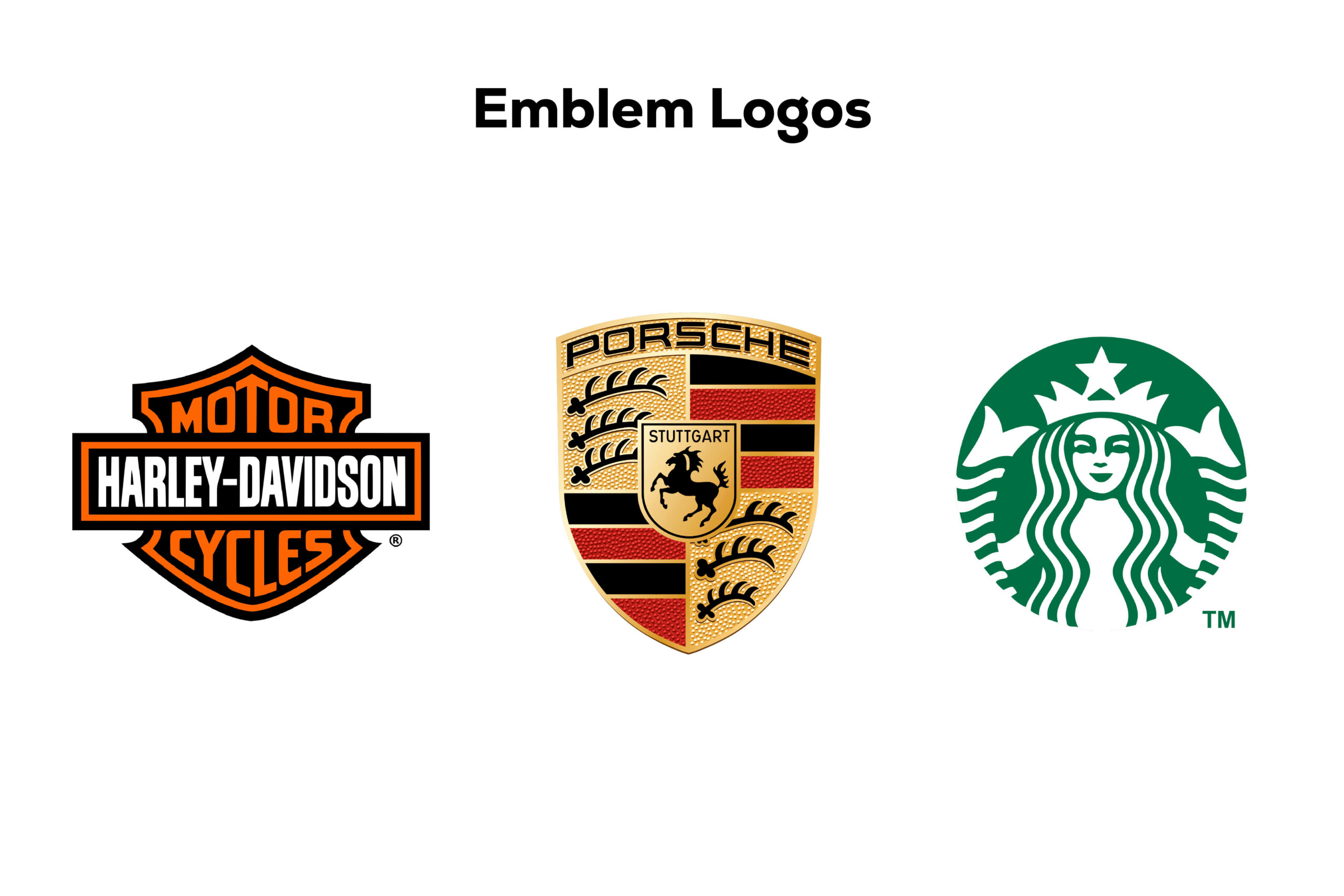
Emblem logos, reminiscent of classic crests, seamlessly intertwine typography with symbols, creating a visual legacy embraced by schools, organizations, and even the iconic Starbucks. Let’s delve into the intricate world of emblem logos, exploring their advantages, potential pitfalls, and why they continue to evoke a sense of tradition in the contemporary branding landscape.
Understanding Emblem Logos
A Fusion of Typography and Symbols
Emblem logos represent a harmonious fusion of typography, symbols, and often intricate design elements. These logos exude a classic aesthetic, making them ideal for institutions, government agencies, and brands seeking a touch of tradition.
Starbucks’ iconic mermaid emblem is a prime example, encapsulating the brand’s identity within a symbolically rich emblem.
Traditional Appeal
Emblem logos inherently carry a traditional and authoritative appeal, making them a popular choice for entities that want to convey a sense of heritage and reliability.
Schools and universities, such as Harvard and Yale, leverage emblem logos to establish a timeless connection with their rich histories.
Powerful Impression
The intricate details and careful combination of elements in emblem logos allow them to make a powerful and lasting impression. These logos often become symbolic representations of the values and ethos of the brand.
The Harley-Davidson emblem, with its renowned crest, exemplifies how an emblem can create a lasting impression synonymous with a brand’s identity.
Advantages of Emblem Logos
Symbolic Representation
Emblem logos excel in providing a symbolic representation of a brand’s identity. The integration of symbols within the typography allows for a nuanced portrayal of values and mission.
Starbucks’ mermaid emblem symbolizes the brand’s commitment to quality and the rich history of coffee.
Establishment of Authority
The traditional and authoritative aesthetic of emblem logos aids in establishing authority. This is particularly beneficial for organizations, government agencies, and institutions.
Government agencies, like NASA, utilize emblem logos to project a sense of authority and reliability in their visual identity.
Timeless Design
Emblem logos have a timeless design that transcends trends. The classic and carefully crafted elements ensure that these logos remain relevant and impactful over extended periods.
The emblem logo of MasterCard is an example of how a timeless design can evolve and adapt to contemporary aesthetics while retaining its core elements.
Considerations for Emblem Logos
Intricate Details and Reproducibility
The intricate details that contribute to the charm of emblem logos can pose challenges in terms of reproducibility, especially in smaller formats like business cards.
Brands must carefully consider the scalability of emblem logos to ensure that the details are not lost when reproduced on various marketing materials.
Versatility Across Platforms
Emblem logos, with their detailed designs, may face limitations in versatility across different platforms. Ensuring adaptability to digital mediums and diverse marketing materials is crucial.
Starbucks, while maintaining a traditional emblem, has successfully adapted its logo to digital platforms and modern packaging, showcasing versatility.
Balancing Tradition with Modernity
Striking a balance between the traditional appeal of emblem logos and modern design trends is essential. Brands may choose to modernize emblem logos while retaining their timeless essence.
Starbucks, in its logo evolution, has showcased how a traditional emblem can undergo subtle modernization without losing its iconic status.
Emblem logos, with their fusion of tradition and symbolism, continue to hold a special place in the realm of brand identity. From conveying authority to leaving a timeless imprint, these logos narrate stories that span generations. As Starbucks and other iconic brands have demonstrated, emblem logos are not just symbols; they are visual testaments to the enduring legacy of a brand.
Conclusion
As we wrap up our expedition through the diverse realms of logo design, we’ve unveiled the power and potential each type carries in shaping a brand’s identity. From the sleek simplicity of Monogram and Wordmark logos to the vibrant storytelling of Pictorial Marks and the whimsical charm of Mascot Logos, each type contributes to the visual symphony of brand recognition.
The combination of symbols and text in Combination Marks, the timeless appeal of Emblems, and the abstract allure of Abstract Logo Marks showcase the versatility within this creative arena. It’s not merely about aesthetics but a strategic dance between visuals and brand messaging.
Remember, the choice of a logo isn’t just a design decision; it’s a statement. So, whether you’re crafting a minimalistic Wordmark or an intricate Emblem, let it echo the essence of your brand. In this logo-rich world, your insignia isn’t just an image; it’s the ambassador of your brand story, leaving a lasting impression in the minds of your audience. Happy logo crafting!
Ready to kickstart your brand with a standout identity? Don’t be a stranger – reach out and let’s make magic happen!
Related Post

In the dynamic realm of business, where first impressions can be the deciding factor for success, the …
Delivering original, refined, and distinctive designs crafted to make a lasting impact and set you apart as a leader in your field, surpassing your competitors.

TEAM UP WITH ME
Ready to kickstart your brand with a standout identity? Don’t be a stranger – reach out and let’s make magic happen!
Recent Posts