Common Designer Mistakes: Navigating the Design Landscape
By Romario Lemon – 16 min read, January 12, 2024

Welcome to the dynamic world of graphic design, where creativity meets the challenges of execution. Did you know that a staggering 75% of consumers judge a brand’s credibility based on its visual appeal? In this ever-evolving landscape, designers, whether seasoned or aspiring, encounter potential pitfalls that can impact the effectiveness of their creations. From neglecting the fundamental principle of contrast to overlooking the crucial final check of proofreading, these common mistakes are more prevalent than one might think. Join us on a journey to explore these intricacies, learning how to recognize and address design missteps for creations that not only captivate but also resonate with audiences.
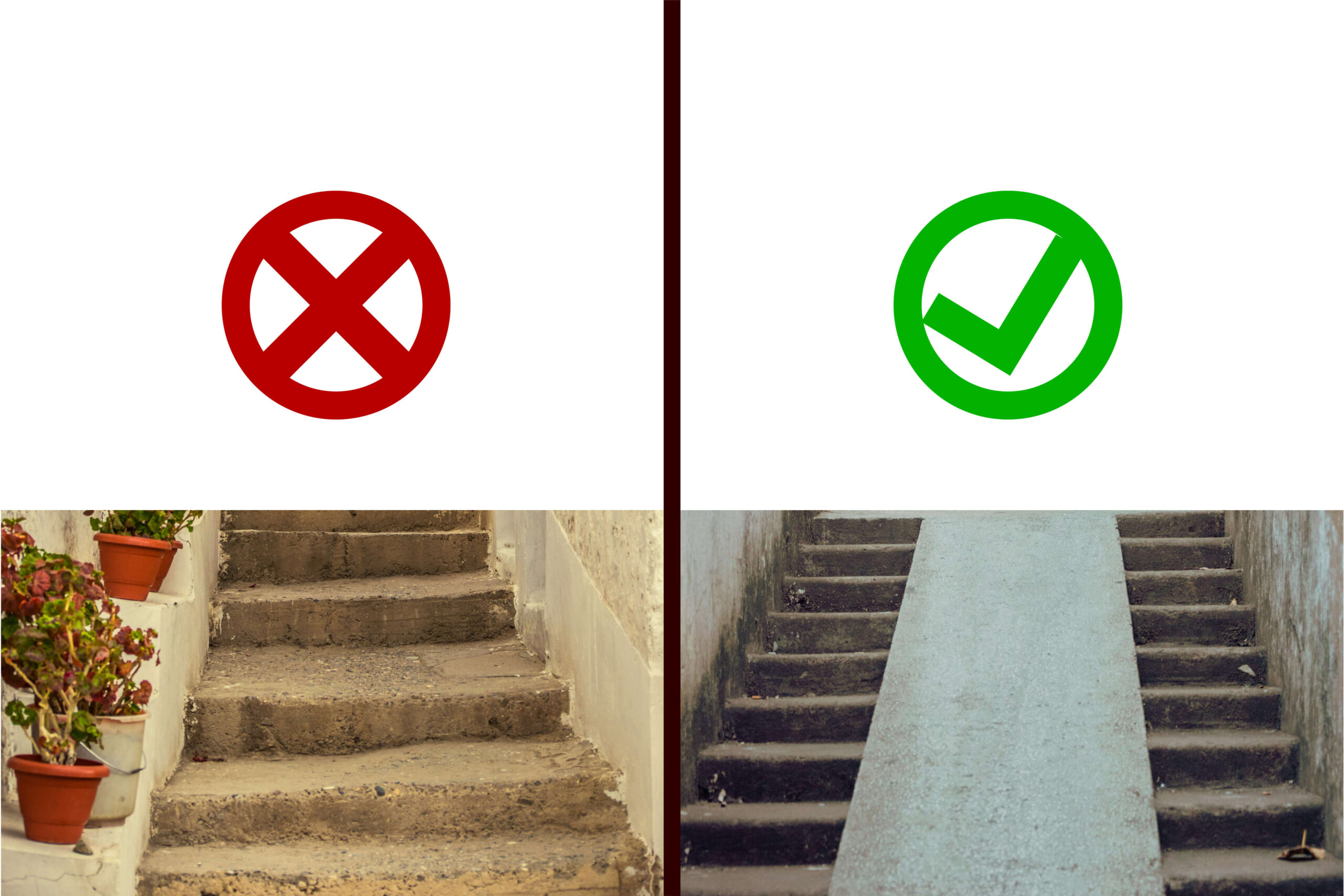
Neglecting Contrast: The Silent Emissary of Impact
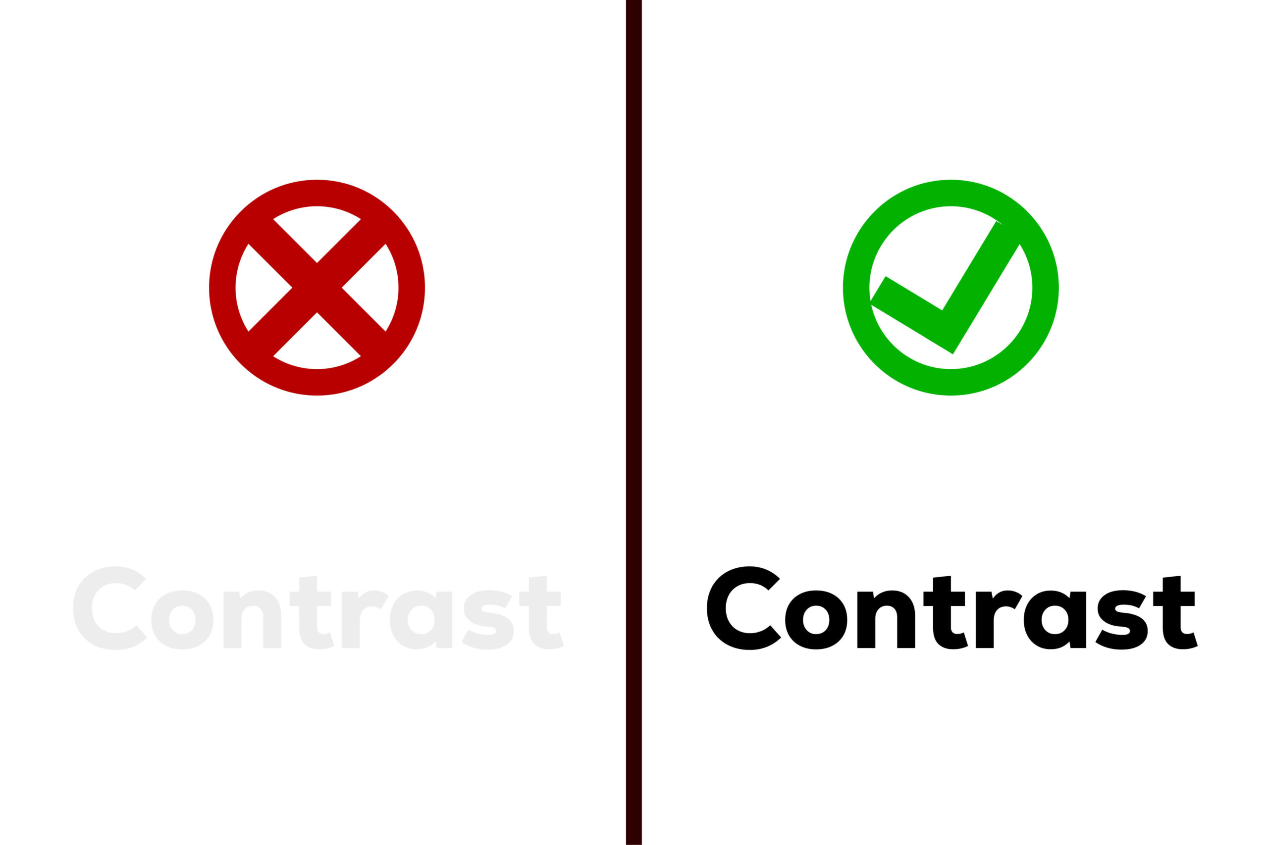
Contrast, often treated as a fundamental principle, is a cornerstone of effective design that is regrettably overlooked more often than not. It serves as the silent powerhouse that breathes life into visual compositions, yet its significance can be underestimated in the hustle of design creation. For designers, embracing contrast through strategic use of colour, size, and font weight is not merely a choice but a necessity to craft designs that resonate and captivate.
Why is Contrast Crucial?
Guiding the Viewer’s Attention:
- Example: Consider a website homepage where the main call-to-action button is designed with a bold, contrasting colour against the background. This stark contrast immediately draws the viewer’s attention to the key element, guiding them towards the desired interaction.
- Importance: Without contrast, essential elements may blend into the background noise, making it challenging for the viewer to discern where their attention should be focused.
Conveying Hierarchy:
- Example: In a poster design, employing contrast in font sizes to highlight the main headline against the subheadings establishes a clear hierarchy. This helps the viewer grasp the information in a structured manner.
- Importance: Hierarchy aids in organizing information, ensuring that the audience processes it in a logical sequence. Without contrast, the visual hierarchy collapses, leading to confusion.
Enhancing Readability:
- Example: In a magazine layout, utilizing contrast between text colour and background ensures legibility. High contrast, such as dark text on a light background or vice versa, contributes to an easy reading experience.
- Importance: Low contrast can strain the viewer’s eyes, making it difficult to engage with the content. By embracing contrast, designers enhance readability, making their designs user-friendly.
Establishing Visual Interest:
- Example: Imagine a product packaging design where the product image is presented with a contrasting background. This not only highlights the product but also adds visual interest and aesthetic appeal.
- Importance: Designs lacking contrast may appear dull and fail to evoke the desired emotional response. By incorporating contrast, designers infuse energy and dynamism into their creations.
Conveying Brand Identity:
- Example: Brand logos often leverage contrast to emphasize the brand name or a symbol. Apple’s iconic logo, a sleek, bitten apple against a monochromatic background, exemplifies the power of contrast in brand recognition.
- Importance: Consistent use of contrast in branding creates a memorable visual identity. It becomes a signature element that consumers associate with the brand, fostering brand recall and trust.
Bad Kerning: Bridging the Gaps in Typography
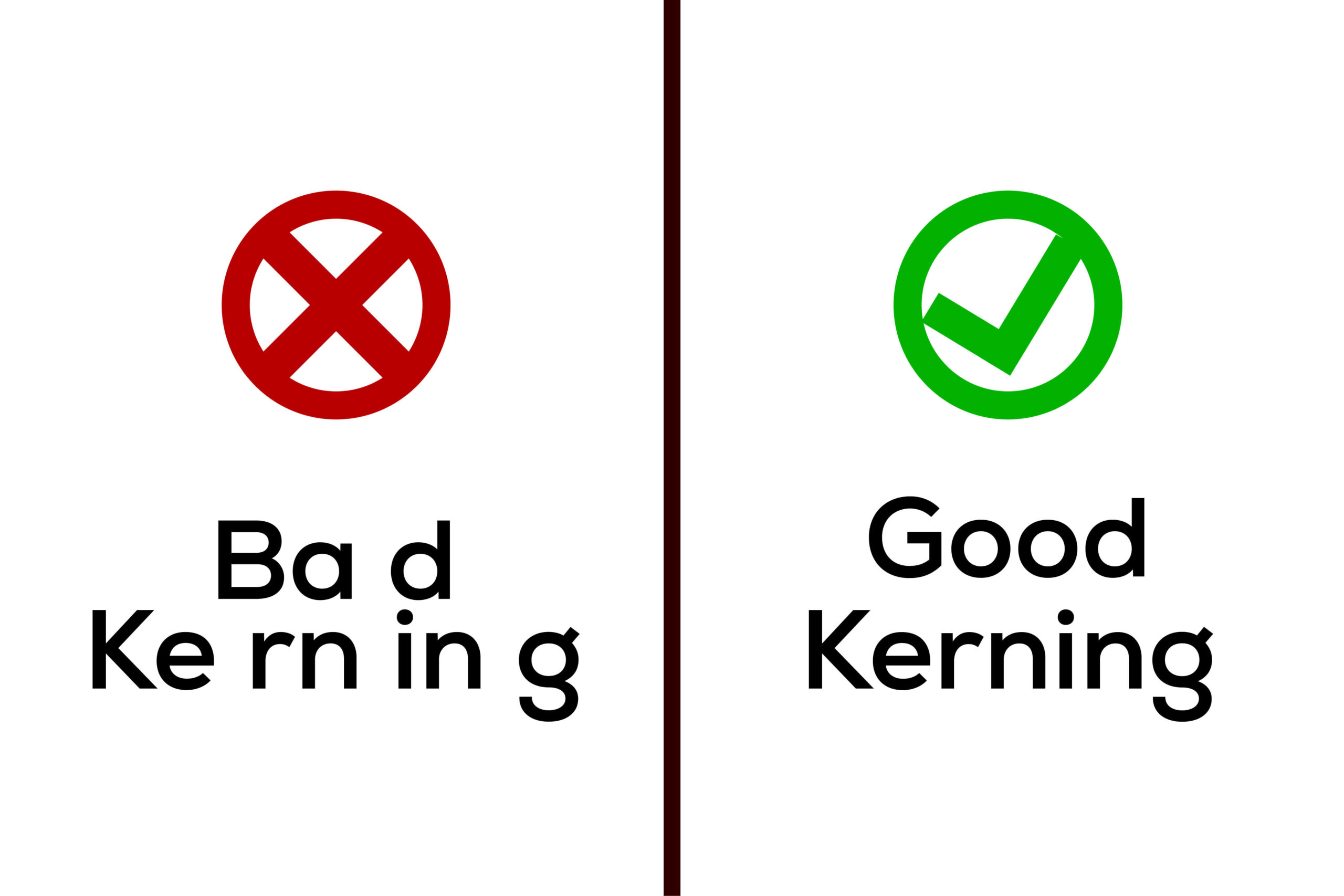
The adjustment of space between characters, a meticulous art known as kerning, stands as a crucial yet frequently undervalued skill in the world of design. In the intricate dance of typography, poor kerning can wield a significant impact, causing disruptions in both the readability and aesthetics of a design. Designers, therefore, find themselves on a quest to master the art of kerning, where every letter must sit harmoniously next to its neighbour.
Why is Kerning a Design Imperative?
Readability Enhancement:
- Example: In a body of text, consider the difference between well-kerned and poorly-kerned text. Optimal kerning ensures that the spacing between characters is balanced, promoting effortless reading.
- Importance: Poor kerning can lead to letters appearing cramped or overly spaced, hindering the flow of reading. Optimal kerning enhances readability, making the content more accessible to the audience.
Aesthetics and Visual Harmony:
- Example: Imagine a logo where the brand name is meticulously kerned, creating a visually pleasing and balanced composition. This attention to detail contributes to the overall aesthetic appeal of the design.
- Importance: Kerning is not just a technicality; it’s an aesthetic choice that impacts the overall visual impression. Well-kerned typography reflects professionalism and visual harmony, elevating the design’s aesthetic quality.
Avoiding Awkward Spacing:
- Example: In a headline, poorly-kerned letters may create awkward gaps or collisions, disrupting the intended visual flow. Proper kerning ensures that letters are spaced evenly, preventing visual distractions.
- Importance: Awkward spacing can divert attention from the message, creating a disjointed and unpolished appearance. Kerning acts as a guardian against visual disruptions, maintaining a seamless design presentation.
Brand Consistency:
- Example: Consider a brand’s marketing collateral where consistent kerning is applied across various materials. This consistency becomes a subtle yet powerful element contributing to brand recognition.
- Importance: Inconsistent kerning can lead to variations in the visual representation of a brand, diluting its identity. Designers, by mastering kerning, contribute to the uniformity and recognisability of brand communication.
Legibility in Small Text:
- Example: In a small font size, inadequate kerning can cause letters to merge, making the text illegible. Precise kerning in small text ensures that each character remains distinct and readable.
- Importance: In scenarios like fine print or captions, where text size is constrained, kerning becomes paramount. It ensures that even in limited space, text remains legible, serving both functional and aesthetic purposes.
Professionalism and Attention to Detail:
- Example: A professionally designed book cover with meticulously kerned title and author name exudes attention to detail. This attention becomes a subtle signifier of the designer’s commitment to quality.
- Importance: Kerning, when executed with precision, becomes a hallmark of professionalism in design. It showcases a designer’s commitment to excellence, creating a positive perception of the work.
Mismatching Fonts: The Symphony of Typography Harmony
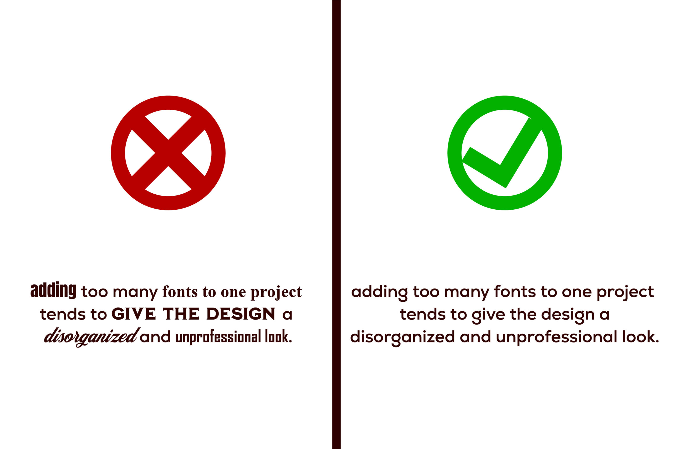
Typography, often heralded as an art form within the design realm, stands as a pivotal element that can either elevate or undermine a well-conceived design. The misuse of fonts, particularly through mismatched pairings, has the potential to unravel the visual harmony of a composition, leading to chaos and confusion in the viewer’s experience. This underscores the critical importance of careful font pairing—a nuanced process where typefaces must not only complement each other but also convey the intended tone and message cohesively.
Why is Font Pairing a Design Essential?
Creating Visual Hierarchy:
- Example: Consider a website where a bold sans-serif font is used for headlines and a clean, serif font for body text. This deliberate font pairing establishes a visual hierarchy, guiding the viewer through the content seamlessly.
- Importance: Mismatched fonts can disrupt the visual flow and hierarchy, confusing the viewer about the significance of different text elements. Proper font pairing ensures a structured and coherent presentation.
Enhancing Readability:
- Example: In a magazine layout, a legible serif font for long paragraphs is paired with a sans-serif font for captions. This intentional choice enhances readability and ensures a comfortable reading experience.
- Importance: Mismatched fonts, especially those with conflicting styles, can strain the reader’s eyes and hinder comprehension. Thoughtful font pairing prioritizes readability, making the design user-friendly.
Conveying Brand Personality:
- Example: Imagine a luxury brand that employs a sophisticated serif font in its logo and marketing materials. This consistent font choice becomes synonymous with the brand’s identity, conveying a sense of elegance and refinement.
- Importance: Inconsistent font choices can dilute a brand’s personality and message. Strategic font pairing reinforces brand identity, communicating a cohesive and intentional visual language.
Setting the Tone:
- Example: A poster for a music festival may use playful and bold script fonts for a lively and energetic tone. This deliberate choice sets the mood and communicates the event’s atmosphere effectively.
- Importance: Font pairing is a powerful tool for setting the overall tone and mood of a design. Mismatched fonts can send conflicting visual signals, leading to a disconnect with the intended message.
Establishing Design Cohesion:
- Example: A product packaging design that pairs a modern sans-serif font with minimalist graphics achieves a cohesive and contemporary aesthetic. Consistency in font choices contributes to overall design cohesion.
- Importance: Inconsistencies in font pairings can result in a fragmented and disjointed visual experience. Careful font selection ensures that all design elements work harmoniously together.
Differentiating Information:
- Example: In an infographic, varied font styles may be used to differentiate between statistics, captions, and key points. This intentional font diversity aids in organizing and clarifying information.
- Importance: When fonts lack distinction, essential information may be lost in the visual clutter. Thoughtful font pairing aids in differentiating text elements, enhancing information clarity.
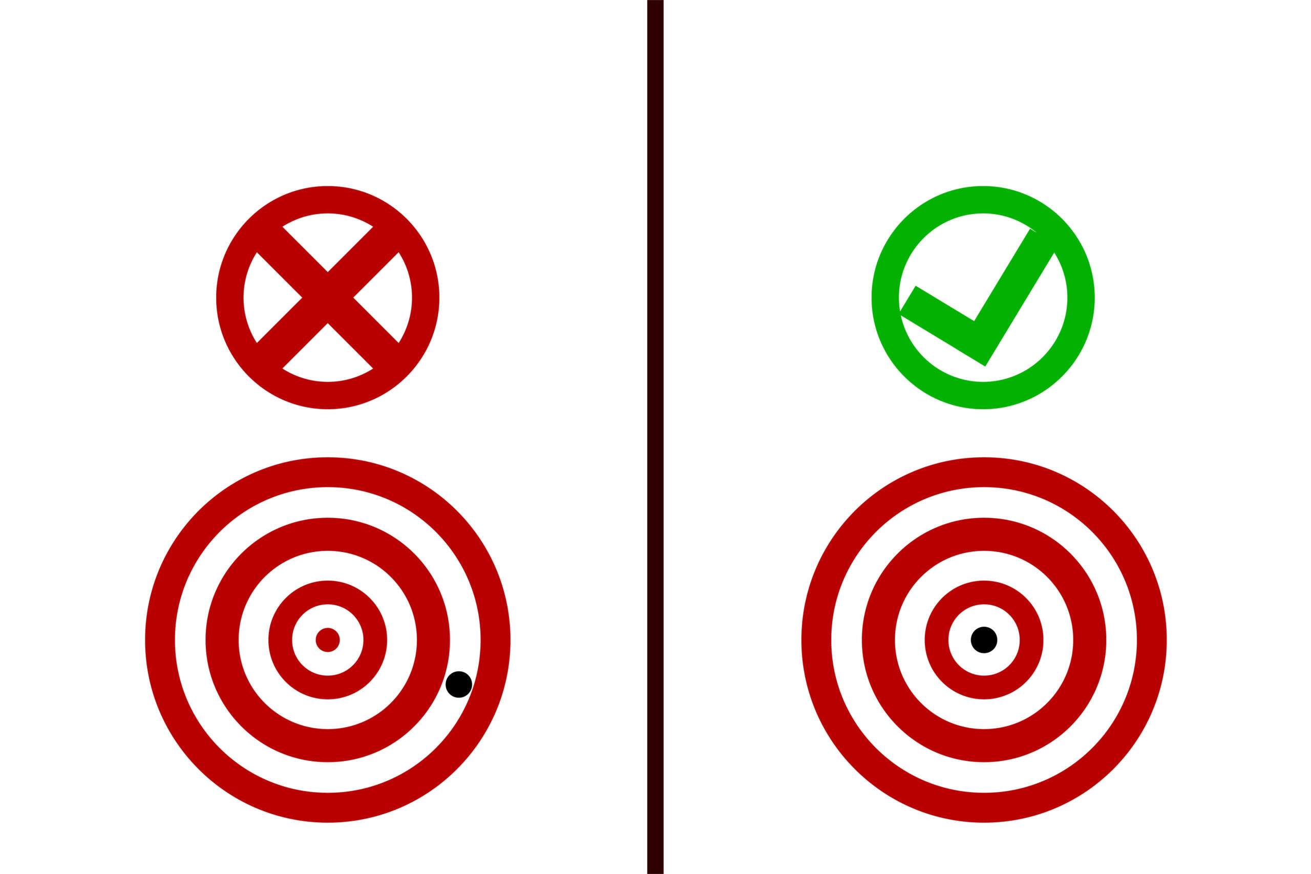
Failing to Scale: Balancing Size for Impact

In the intricate tapestry of design, the role of scale emerges as a pivotal force, wielding the power to guide the viewer’s attention and establish a coherent hierarchy within a composition. However, the oft-overlooked aspect of neglecting to scale elements appropriately can unravel the visual narrative, resulting in unnecessary clutter and confusion. Designers, therefore, find themselves challenged to master the nuanced art of proportion, ensuring that each element contributes harmoniously to the overall composition.
Why is Scale a Design Imperative?
Guiding Viewer’s Attention:
- Example: Imagine a webpage where the headline is presented in a large, bold font, while secondary information is smaller. This intentional scaling immediately guides the viewer’s attention to the primary message.
- Importance: Neglecting proper scaling can result in all elements competing for attention, creating visual chaos. Strategic scaling directs the viewer, ensuring a clear focal point.
Establishing Visual Hierarchy:
- Example: In an infographic, scaling elements based on importance—larger for key statistics and smaller for supporting information—creates a visual hierarchy. This hierarchy aids in organizing and presenting information logically.
- Importance: Without thoughtful scaling, a design lacks hierarchy, making it challenging for the audience to prioritize information. Scaling is a tool for organizing content with visual emphasis.
Preventing Visual Clutter:
- Example: Picture a poster with images and text of varying sizes, all competing for attention. By scaling elements appropriately, the designer ensures that each component has its designated space, avoiding clutter.
- Importance: Improper scaling can lead to a cluttered and overwhelming visual experience. Appropriate scaling maintains visual order, allowing each element to breathe and be appreciated.
Conveying Proportional Harmony:
- Example: In a product packaging design, scaling graphics and text proportionally ensures a balanced and aesthetically pleasing presentation. Each element contributes harmoniously to the overall visual appeal.
- Importance: Lack of attention to scale can result in disproportionate designs, disrupting visual harmony. Proportional scaling contributes to a balanced and polished aesthetic.
Ensuring Readability:
- Example: Consider a book cover where the title is scaled appropriately for legibility, ensuring it is readable even from a distance. Scaling text elements thoughtfully contributes to enhanced readability.
- Importance: Scaling is integral to readability. Inadequate scaling, especially in text, can hinder legibility, impacting the effectiveness of the design in conveying its message.
Optimizing Composition Balance:
- Example: In a logo design, scaling the icon in harmony with the accompanying text ensures a balanced composition. Proper scaling contributes to a visually pleasing and well-balanced design.
- Importance: Without proportional scaling, a design may feel imbalanced, lacking a sense of visual equilibrium. Achieving balance through scaling enhances the overall aesthetic appeal.
Responsive Design Considerations:
- Example: In a website design, elements scaled appropriately for desktop may need adjustment for mobile devices. Consideration of scale in responsive design ensures a seamless user experience across various platforms.
- Importance: In today’s digital age, where designs must adapt to diverse screen sizes, scaling becomes a crucial aspect of ensuring a consistent and user-friendly experience.
Not Following Hierarchy: The Symphony of Visual Order
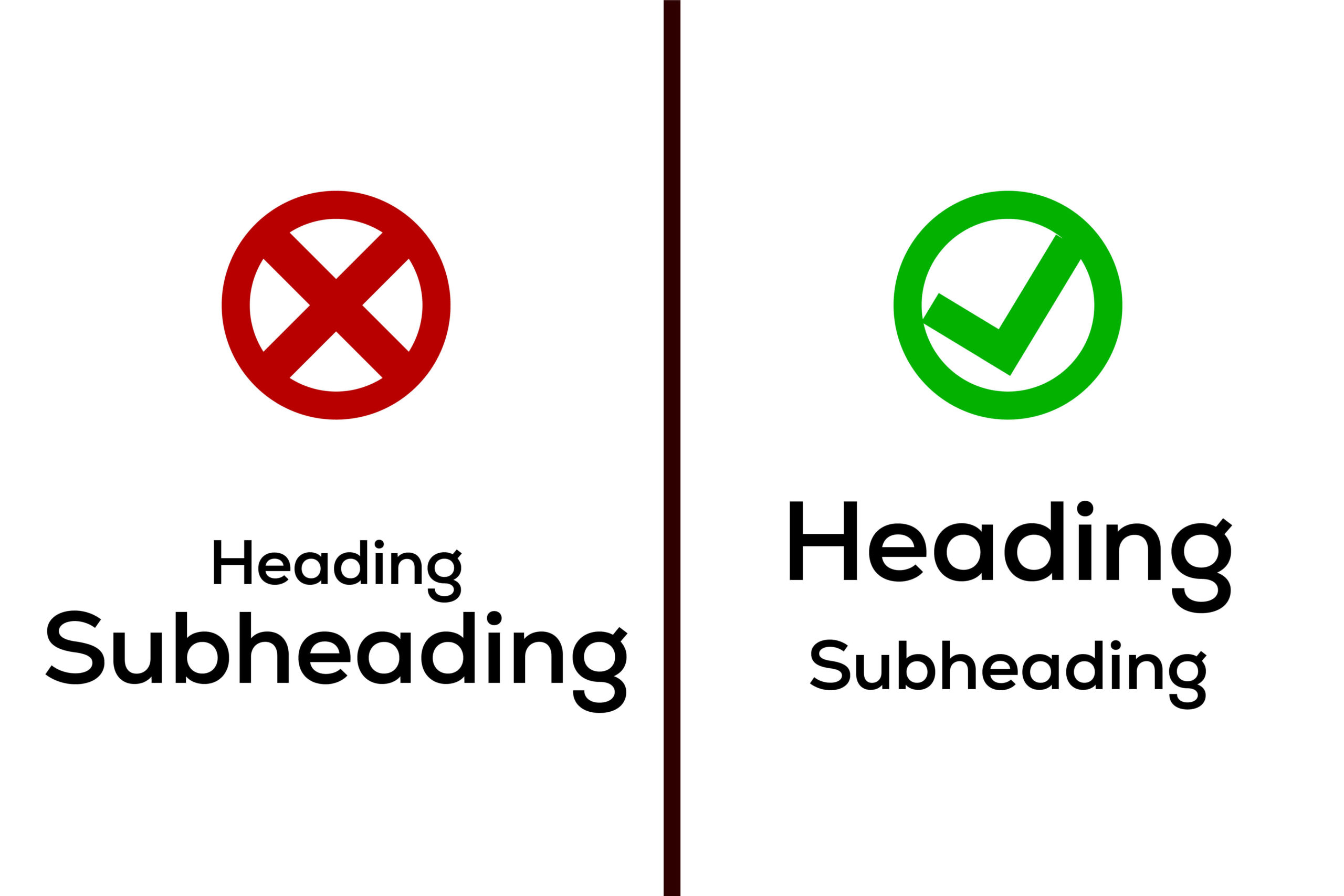
Establishing a clear visual hierarchy is not merely a design choice; it is a strategic imperative that shapes how viewers perceive and engage with a composition. In the absence of a well-structured hierarchy, the audience may find themselves adrift in a sea of visual elements, struggling to decipher the intended message. Designers wield the power to guide the viewer’s gaze with purpose through strategic use of size, colour, and placement—a mastery crucial for weaving a seamless narrative within a design.
Why is Visual Hierarchy a Design Essential?
Guiding Viewer Attention:
- Example: Picture a website homepage where the main headline, in a larger and bold font, immediately draws attention. Supporting text and imagery are strategically sized and placed to guide the viewer’s gaze towards key information.
- Importance: In the absence of a defined hierarchy, viewers may feel overwhelmed by competing elements, diminishing the impact of the intended message. Visual hierarchy directs attention, ensuring crucial elements are noticed.
Organizing Information:
- Example: In an infographic about a complex process, varied icon sizes, bold headers, and contrasting colours are used to differentiate between steps. This intentional hierarchy aids in organizing information for easy comprehension.
- Importance: Without a structured hierarchy, information can become tangled and confusing. Viewers may struggle to prioritize details, hindering their ability to absorb and understand the content.
Conveying Importance:
- Example: Imagine a print advertisement where the product image is large and central, accompanied by a concise headline in a bold font. Smaller, supporting details are strategically placed to complement the hierarchy, emphasizing the key message.
- Importance: Visual hierarchy is a tool for communicating the relative importance of different elements. Neglecting this hierarchy may result in critical messages being overlooked or overshadowed.
Enhancing Readability:
- Example: In a magazine layout, varying font sizes and boldness are employed to distinguish between headlines, subheadings, and body text. This careful consideration enhances readability and ensures a smooth reading experience.
- Importance: A lack of visual hierarchy can lead to a jumbled and overwhelming visual experience. Readers may find it challenging to navigate through the content, affecting overall readability.
Creating Emotional Impact:
- Example: Consider a charity poster where a powerful image takes center stage, surrounded by impactful quotes in a larger font. This deliberate hierarchy creates an emotional impact, guiding viewers towards a compassionate response.
- Importance: Visual hierarchy influences the emotional resonance of a design. Strategic sizing and placement evoke specific reactions, fostering a deeper connection between the audience and the intended message.
Fostering Engagement:
- Example: In a social media post, the call-to-action button is prominently sized and coloured, standing out against the surrounding content. This intentional hierarchy encourages user interaction and engagement.
- Importance: Effective visual hierarchy is an engagement catalyst. Without it, important elements may go unnoticed, diminishing the chances of user interaction and response.
Failing to Proofread: The Crucial Final Check
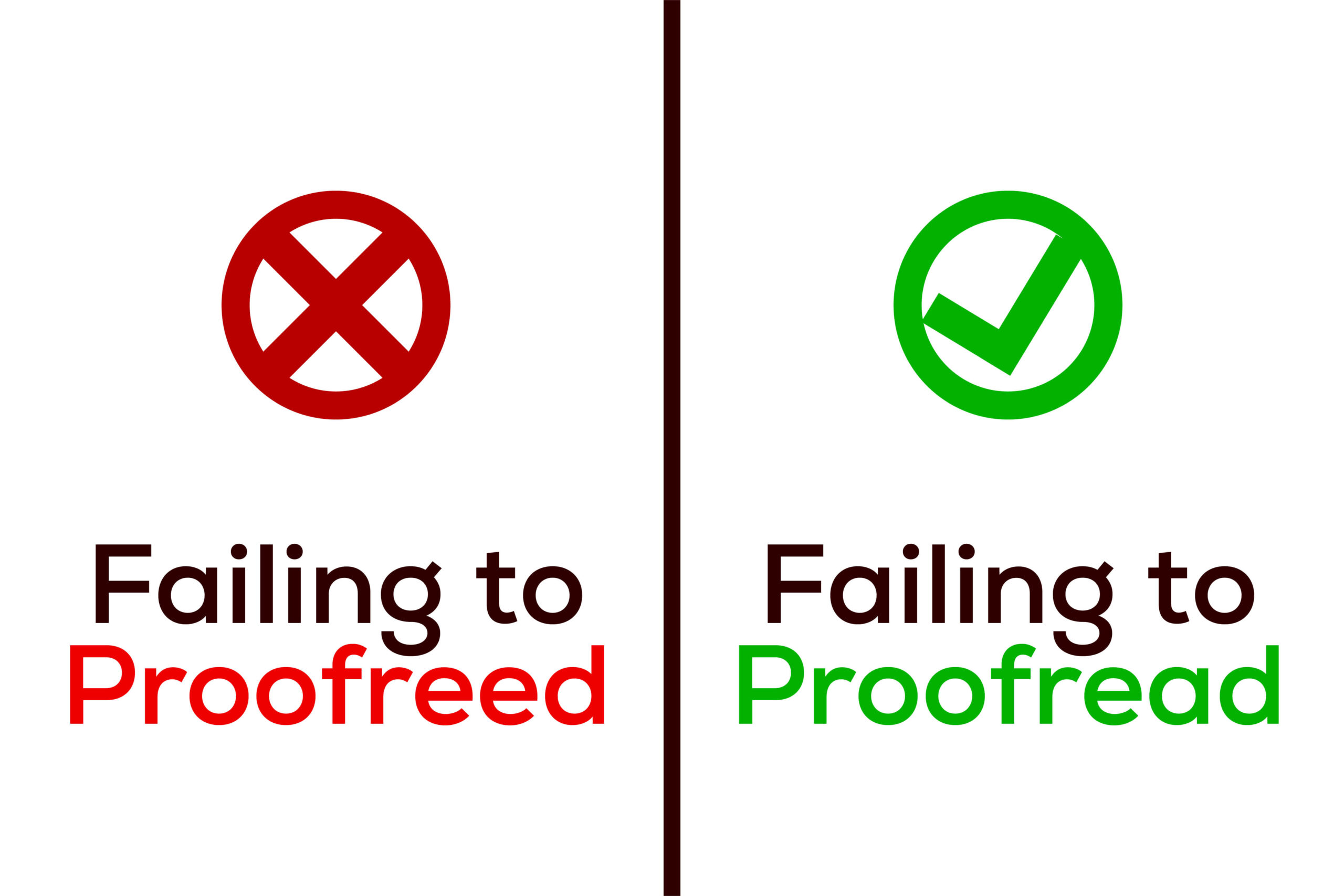
In the whirlwind of design creation, the often-overlooked linchpin of perfection is meticulous proofreading. This critical step, unfortunately, is frequently sacrificed in the haste to bring a design to life, giving rise to embarrassing and potentially costly mistakes. The consequences of neglecting proofreading, ranging from spelling errors to grammatical mishaps, extend beyond the design itself, casting shadows on the credibility of the brand it represents. Designers must recognize the profound importance of meticulous proofreading, a practice that goes beyond mere error correction to safeguard the integrity of both form and content.
Why is Meticulous Proofreading a Design Essential?
Preserving Credibility:
- Example: Consider a marketing brochure where a prominent typo alters a product feature, leading to confusion. This oversight undermines the brand’s credibility, leaving potential customers questioning the attention to detail.
- Importance: Spelling errors or grammatical mishaps erode the trust that audiences place in a brand. Meticulous proofreading preserves credibility, ensuring the brand is perceived as professional and reliable.
Avoiding Costly Reprints:
- Example: In a print advertisement, an unnoticed typo in contact information necessitates a costly reprint. This oversight not only incurs financial repercussions but also disrupts planned timelines.
- Importance: Proofreading is a cost-saving measure. Catching errors before production prevents the need for expensive reprints and corrections, safeguarding both budget and schedule.
Enhancing User Experience:
- Example: Imagine a website with a navigation menu containing typographical errors. Visitors may find it challenging to navigate, negatively impacting their overall user experience.
- Importance: Design is not solely about aesthetics; it’s about user experience. Meticulous proofreading ensures that the design elements contribute to a seamless and enjoyable interaction for the audience.
Consistency Across Platforms:
- Example: A company’s social media posts containing inconsistent messaging due to overlooked errors create confusion among followers. This lack of consistency can dilute the brand’s messaging.
- Importance: Proofreading is a guardian of brand consistency. Ensuring accuracy across all platforms maintains a unified and coherent brand voice, reinforcing the brand’s identity.
Avoiding Legal Pitfalls:
- Example: A product packaging design with inaccurate ingredient information may lead to legal consequences. Proofreading is essential to ensure that all information, especially legal and regulatory, is accurate.
- Importance: Design is not immune to legal scrutiny. Meticulous proofreading serves as a preventive measure against legal issues that may arise due to inaccuracies in the design content.
Building Professionalism:
- Example: A business proposal riddled with grammatical errors may create doubts about the professionalism of the company. First impressions matter, and meticulous proofreading contributes to a polished and professional image.
- Importance: Design is a reflection of the professionalism of a brand or business. Attention to detail in proofreading signals a commitment to excellence, fostering positive perceptions among stakeholders.
Ignoring the Target Audience: Designing in a Vacuum
Design, in its essence, is a dynamic conversation between the creator and the audience, a reciprocal exchange that demands careful attention to the preferences, tastes, and expectations of the target demographic. The repercussions of ignoring this crucial aspect are profound, leading to designs that lack resonance and fail to captivate the intended audience. Designers, therefore, embark on a journey of thorough research, delving into the intricacies of demographics and psychographics to create designs that not only visually appeal but deeply resonate.
Why Audience-Centric Design Matters:
Understanding Demographics:
- Example: Imagine designing a promotional campaign for a tech product. Understanding the age, gender, and geographic location of the target audience is paramount. A sleek, modern design may resonate with a younger demographic, while older audiences may prefer a more classic aesthetic.
- Importance: Neglecting demographic nuances can lead to designs that feel disconnected from the intended audience. Audience-centric design ensures that visual elements align with the demographic characteristics, creating a relatable and engaging experience.
Navigating Psychographics:
- Example: Consider a lifestyle brand targeting individuals with a passion for sustainability. Design elements that reflect eco-conscious values, such as earthy colours and natural imagery, resonate with the psychographic profile of the audience.
- Importance: Psychographics delve into lifestyle, values, and interests. Designers who overlook these aspects risk creating designs that lack a meaningful connection. Audience-centric design aligns visual elements with the audience’s preferences and beliefs.
Cultural Sensitivity:
- Example: Designing a global marketing campaign requires a keen understanding of cultural nuances. Colours, symbols, and imagery may carry different meanings in various cultures. A design insensitive to these differences can lead to misinterpretation or even offense.
- Importance: Ignoring cultural context can result in designs that alienate rather than attract. Audience-centric design acknowledges and respects cultural diversity, ensuring that the design resonates positively with a global audience.
Tailoring Communication Style:
- Example: Crafting content for a youth-oriented brand may involve adopting a casual and conversational tone. Understanding the communication preferences of the audience allows designers to tailor the messaging style for maximum impact.
- Importance: Ineffective communication styles can lead to a disconnect. Audience-centric design considers how the target audience prefers to be addressed, ensuring that the design speaks directly to them in a language they understand and appreciate.
Eliciting Emotional Responses:
- Example: A charity organization designing a fundraising campaign for animal welfare may leverage heart-warming visuals and empathetic messaging. Understanding the emotional triggers of the audience allows for the creation of designs that evoke the desired response.
- Importance: Emotional resonance is a powerful motivator. Designs that align with the emotional landscape of the audience forge a stronger connection. Audience-centric design taps into the emotions that drive engagement and action.
Ensuring Accessibility:
- Example: Designing a website accessible to all requires considerations for individuals with disabilities. Implementing features like alt text for images or readable fonts caters to a broader audience, enhancing inclusivity.
- Importance: Inaccessible designs exclude segments of the audience, limiting reach and impact. Audience-centric design embraces accessibility standards, ensuring that the design is welcoming and usable for everyone.
Overlooking Accessibility: Design for All
In an era that champions inclusivity, designers find themselves at the forefront of a crucial mission: prioritizing accessibility. Failure to consider the diverse needs of users, including those with disabilities such as colour blindness or visual impairments, can result in alienating a significant portion of the audience. Designers are not merely creators; they are architects of experiences, and to neglect accessibility is to erect barriers that hinder rather than welcome. Let’s delve into the nuanced realm of accessibility, exploring why it is not just a checkbox but an ethical imperative and a gateway to a broader, more meaningful audience.
Why Accessibility in Design is Non-Negotiable:
Embracing Inclusivity:
- Example: Designing a website with high colour contrast and readable fonts caters to users with visual impairments. Implementing screen reader-friendly features ensures that individuals with different abilities can navigate and engage with the content seamlessly.
- Importance: Inclusivity is at the heart of accessibility. By prioritizing design elements that accommodate diverse needs, designers extend an invitation to everyone, fostering a sense of belonging and participation.
Catering to Colour Blindness:
- Example: Choosing a colour palette that avoids relying solely on colour distinctions ensures that individuals with colour blindness can still distinguish between different elements. Implementing clear icons or labels alongside color-coded information further enhances accessibility.
- Importance: Colour blindness affects a significant portion of the population. Designs that consider colour-independent cues not only cater to this demographic but also enhance clarity for all users.
Navigating Visual Impairments:
- Example: Utilizing scalable fonts, providing alt text for images, and maintaining a logical reading order benefit users with visual impairments. Websites or apps designed with accessibility in mind use descriptive text that can be interpreted by screen readers, ensuring an inclusive experience.
- Importance: Visual impairments vary in their impact. Designing with accessibility in mind means acknowledging these variations and implementing features that accommodate users across the visual spectrum.
Adhering to Web Content Accessibility Guidelines (WCAG):
- Example: Incorporating features like closed captions for videos, ensuring keyboard navigation, and providing alternative text for non-text content aligns with WCAG standards. These guidelines offer a comprehensive framework for creating accessible digital content.
- Importance: WCAG provides a globally recognized set of standards for accessibility. Adhering to these guidelines not only ensures legal compliance but also sets a benchmark for creating user-friendly designs.
Meeting Legal and Ethical Obligations:
- Example: Several countries have implemented accessibility laws, such as the Americans with Disabilities Act (ADA) in the United States. Failure to comply with these laws not only carries legal consequences but also reflects poorly on the brand’s commitment to inclusivity.
- Importance: Beyond legal considerations, accessibility is an ethical imperative. Designers have a responsibility to create experiences that are welcoming, irrespective of individual abilities.
- Enhancing User Experience for All:
- Example: A mobile app with a simple, intuitive interface benefits all users, including those with cognitive impairments. Streamlining navigation and avoiding unnecessary complexity contribute to a universally positive user experience.
Importance: Designs that prioritize accessibility inherently elevate the overall user experience. Simplicity and clarity benefit everyone, creating a more enjoyable interaction with digital content.
Conclusion
As we conclude our exploration of the nuanced realm of graphic design, it’s evident that steering clear of common mistakes is paramount for creating visually compelling and impactful designs. From the often-overlooked importance of contrast to the meticulous details of proofreading, each aspect plays a vital role in the success of a design.
Remember, every project is a canvas for growth and refinement. By recognizing and addressing these pitfalls, designers can elevate their craft, ensuring their creations not only grab attention but also convey messages with clarity and resonance. In this intricate tapestry of design, the journey from concept to execution is filled with opportunities for improvement.
So, embrace the artistry of rectifying and avoiding these design missteps, and let your creativity shine through. As the statistic reveals, a remarkable 75% of consumers judge a brand’s credibility based on its visual appeal. Therefore, by mastering the nuances discussed, designers can not only captivate their audience but also establish a strong visual identity that stands the test of credibility and time. Cheers to creating designs that not only look good but also make a lasting impact!
Ready to kickstart your brand with a standout identity? Don’t be a stranger – reach out and let’s make magic happen!
Related Post


In the dynamic realm of business, where first impressions can be the deciding factor for success, the …
Delivering original, refined, and distinctive designs crafted to make a lasting impact and set you apart as a leader in your field, surpassing your competitors.

TEAM UP WITH ME
Ready to kickstart your brand with a standout identity? Don’t be a stranger – reach out and let’s make magic happen!
Recent Posts