Safe, loved, and growing every day
Genuine Love Childcare and Transportation is all about turning everyday care into extraordinary experiences. This isn’t just a daycare; it’s where your child’s imagination soars, their curiosity is fueled, and their well-being is top priority. Each day is a new adventure, filled with fun learning, playful exploration, and meaningful growth, all under the watchful care of passionate caregivers who treat every child like family.
And the best part? Genuine Love believes top-notch childcare shouldn’t break the bank. With affordable rates, parents can relax knowing their children are not just safe, but truly cherished and encouraged to flourish, all without the financial stress.
The concept
I approached the project by first analyzing key phrases from the brief, utilizing a technique where I selected a few core words and then expanded on their meanings by identifying related terms. Through this process, I distilled the essence of the brand into nine guiding concepts: Authentic, Original, Protection, Shield, Traditional, Love, Genuine, Different, and Growth. Each word was carefully chosen to capture the heart of the brand’s identity, setting a strong foundation for the logo development.
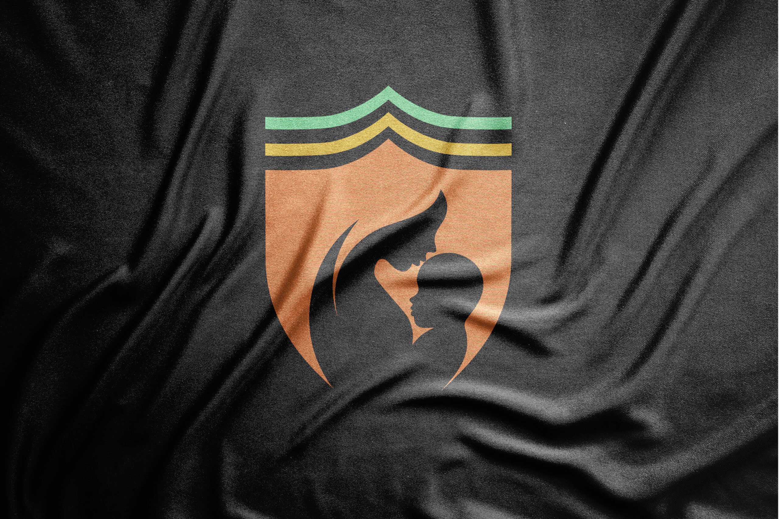
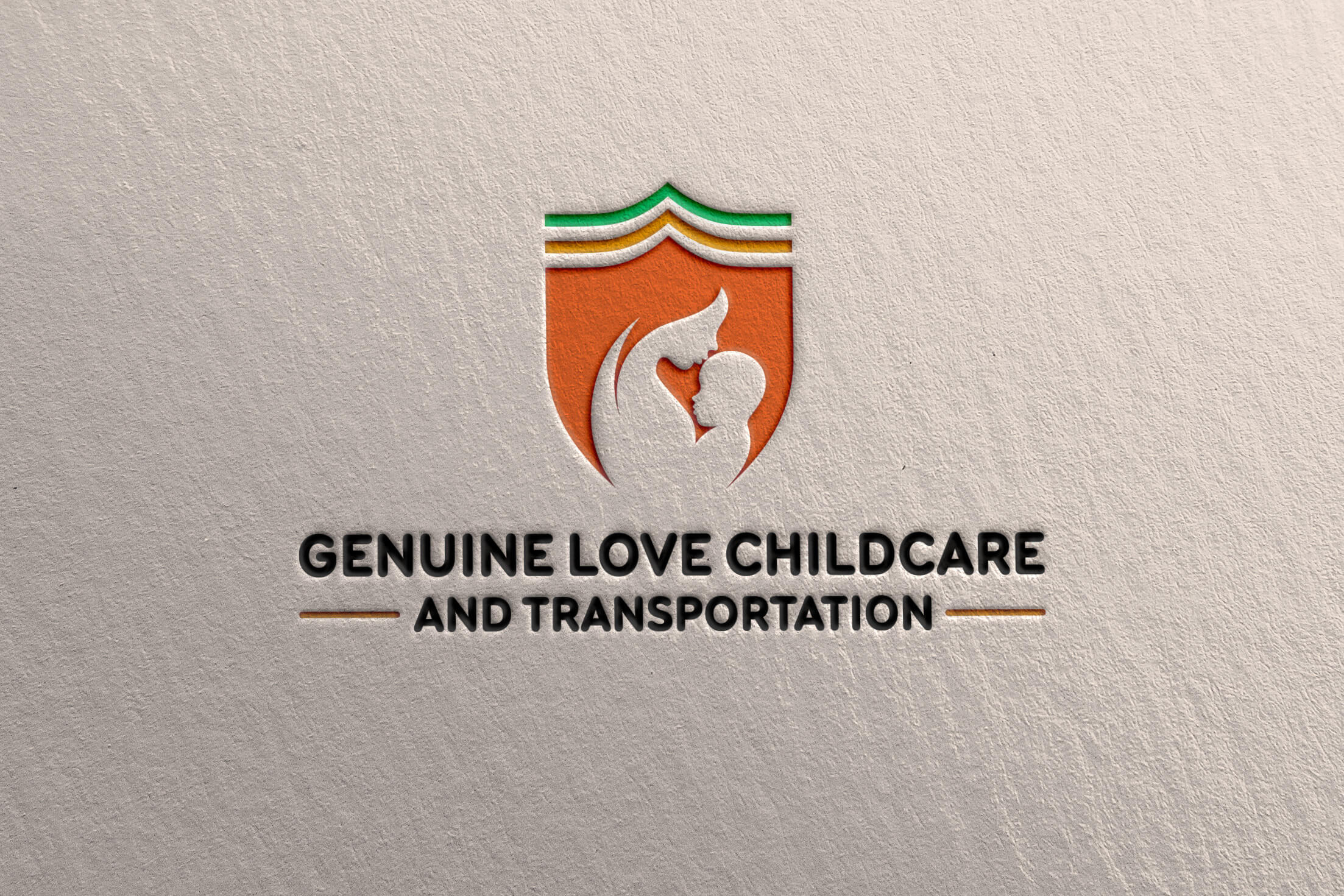
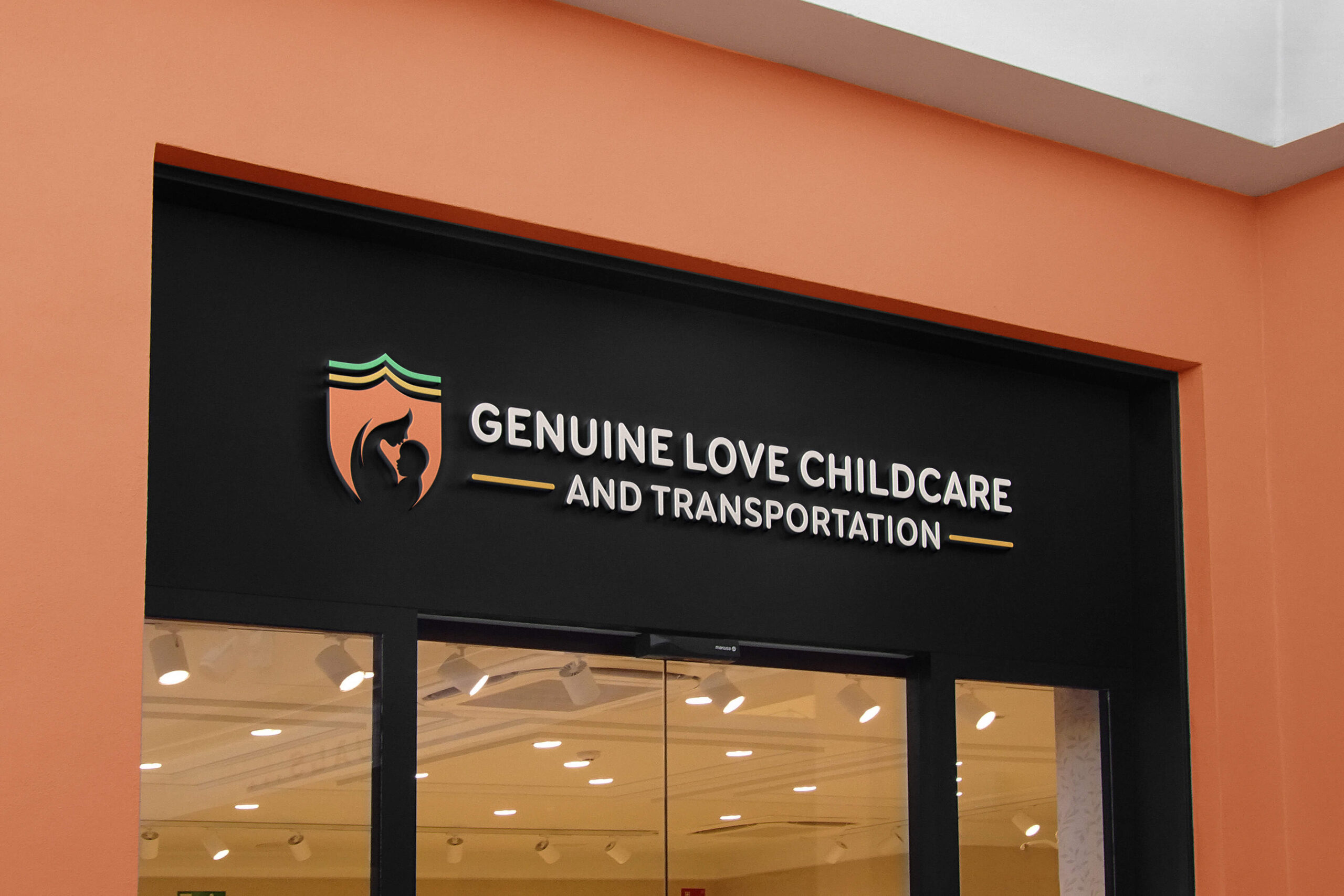
With these guiding words in mind, I began the creative process by sketching various ideas. After refining several drafts, I transitioned to digital tools to bring clarity and precision to my designs. The final concept took shape as a logo that evokes both warmth and strength. At its core, the design features the shape of a shield, universally recognized as a symbol of protection. The shield is timeless, powerful, and easily identifiable, representing the core values of safety and security for children.
Within the shield, I utilized negative space to depict a mother tenderly cradling a child, symbolizing the genuine love, care, and nurturing environment that the brand seeks to provide. Arrows within the design signify growth and upward movement, subtly rising above the shield to suggest progress, development, and the forward-thinking nature of the brand. The combination of these elements resulted in a logo that is not only visually appealing but also rich in meaning—original, distinct, and deeply connected to the brand’s mission.
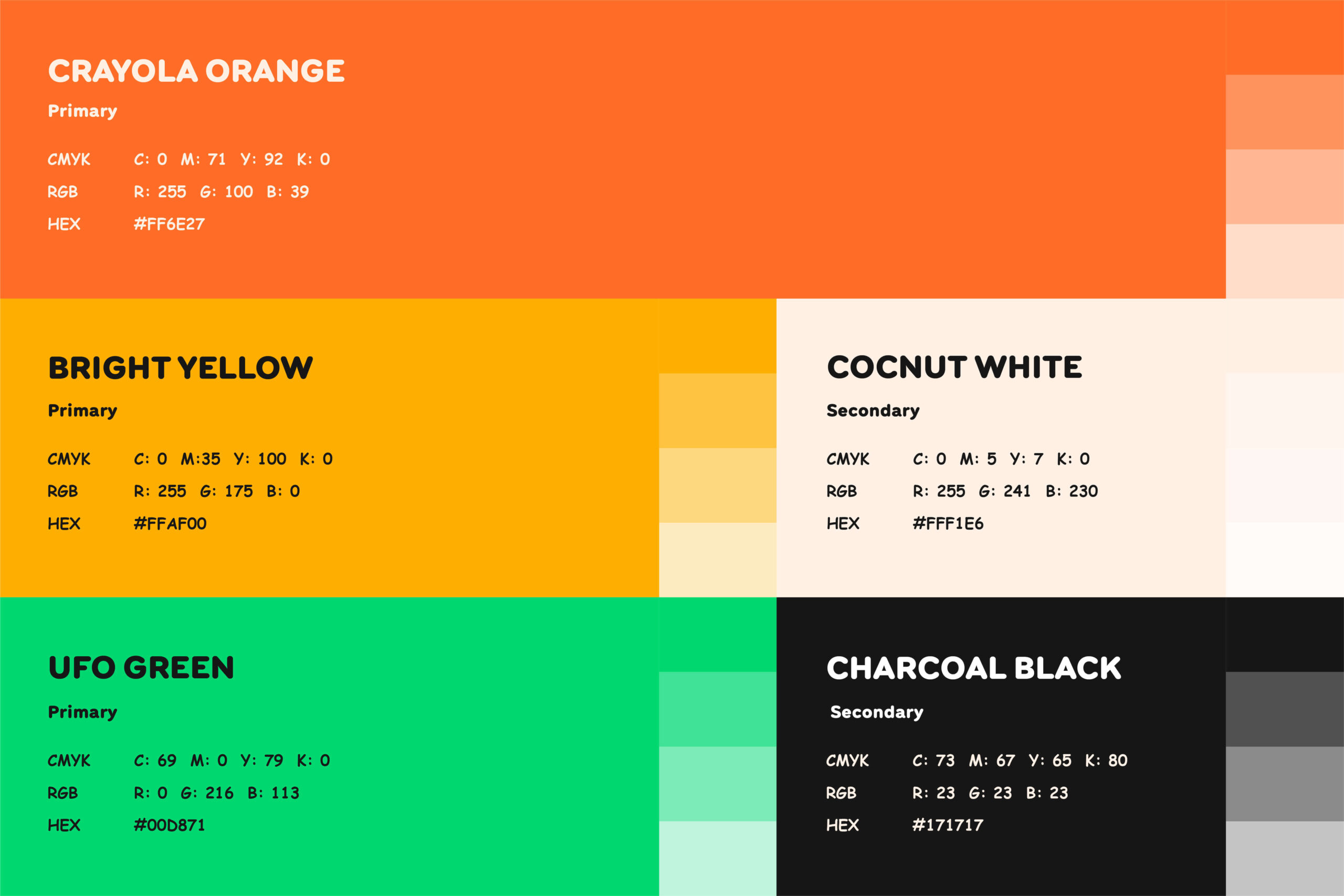
In terms of color, the client had specific requests to incorporate Yellow, Orange, and Green into the brand palette. Since the brand caters to a daycare center, I complemented these lively tones with shades of white and black to create balance. Using a refined color wheel method, I selected hues that would be both engaging and harmonious. Crayola Orange was chosen for its vibrant, playful nature, capturing attention instantly. The bold, lively yellow brings energy and positivity to the design. UFO Green adds an unexpected and unique touch, its bright hue evoking freshness and creativity. For contrast, Coconut White offers a softer, more welcoming alternative to standard white, while Charcoal Black provides a refined, more approachable version of pure black.
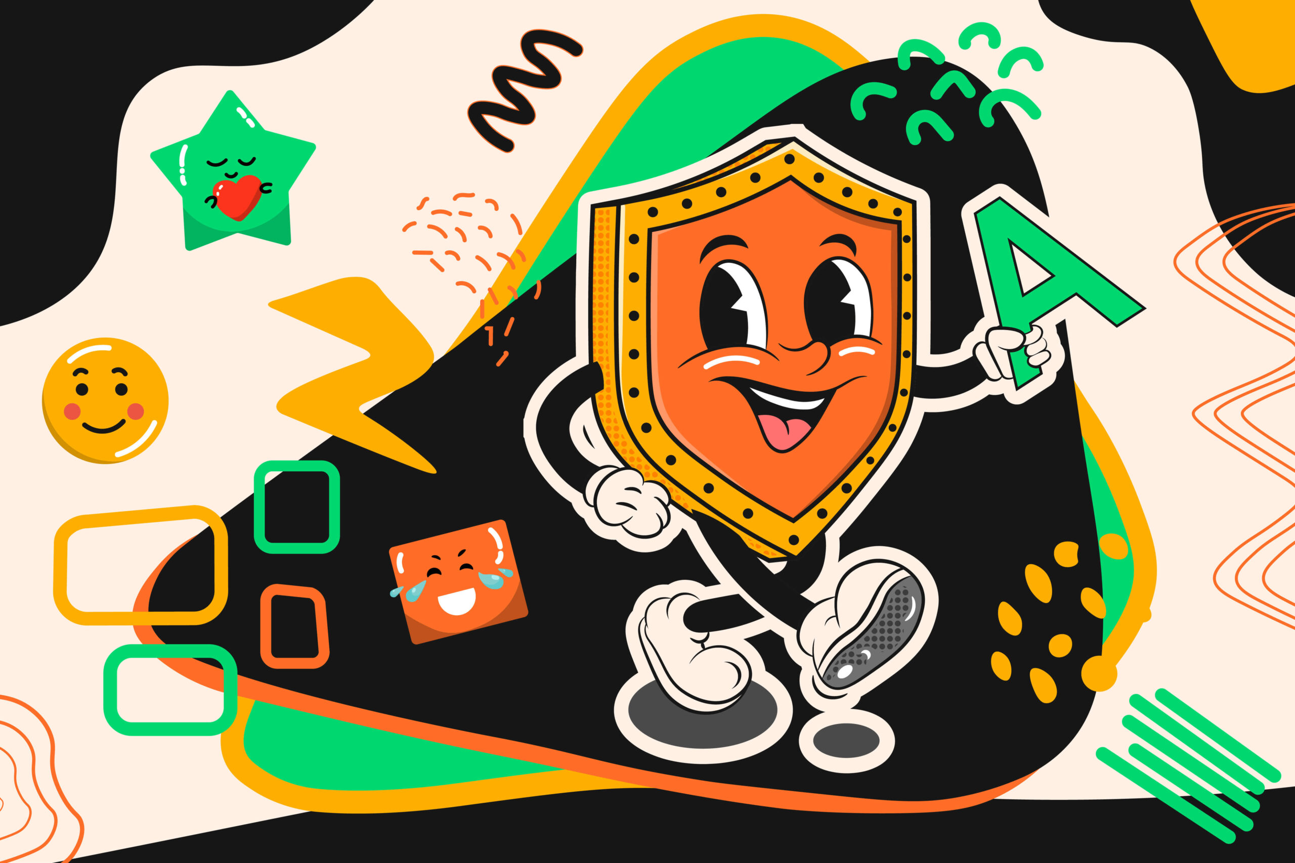
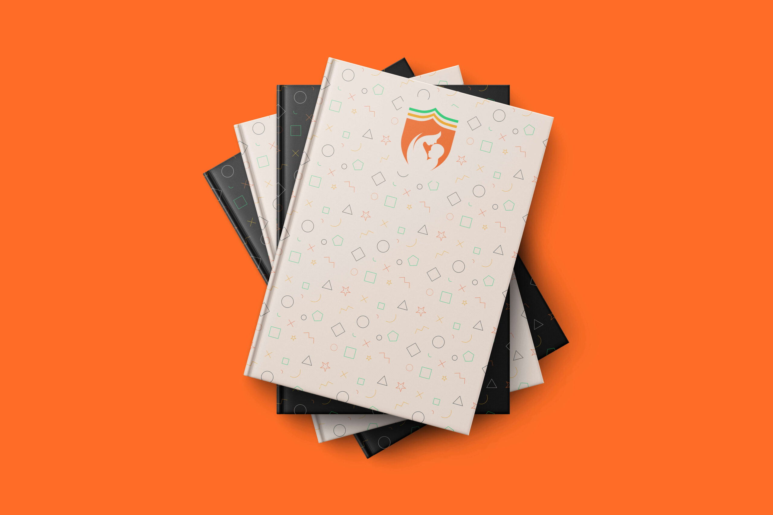
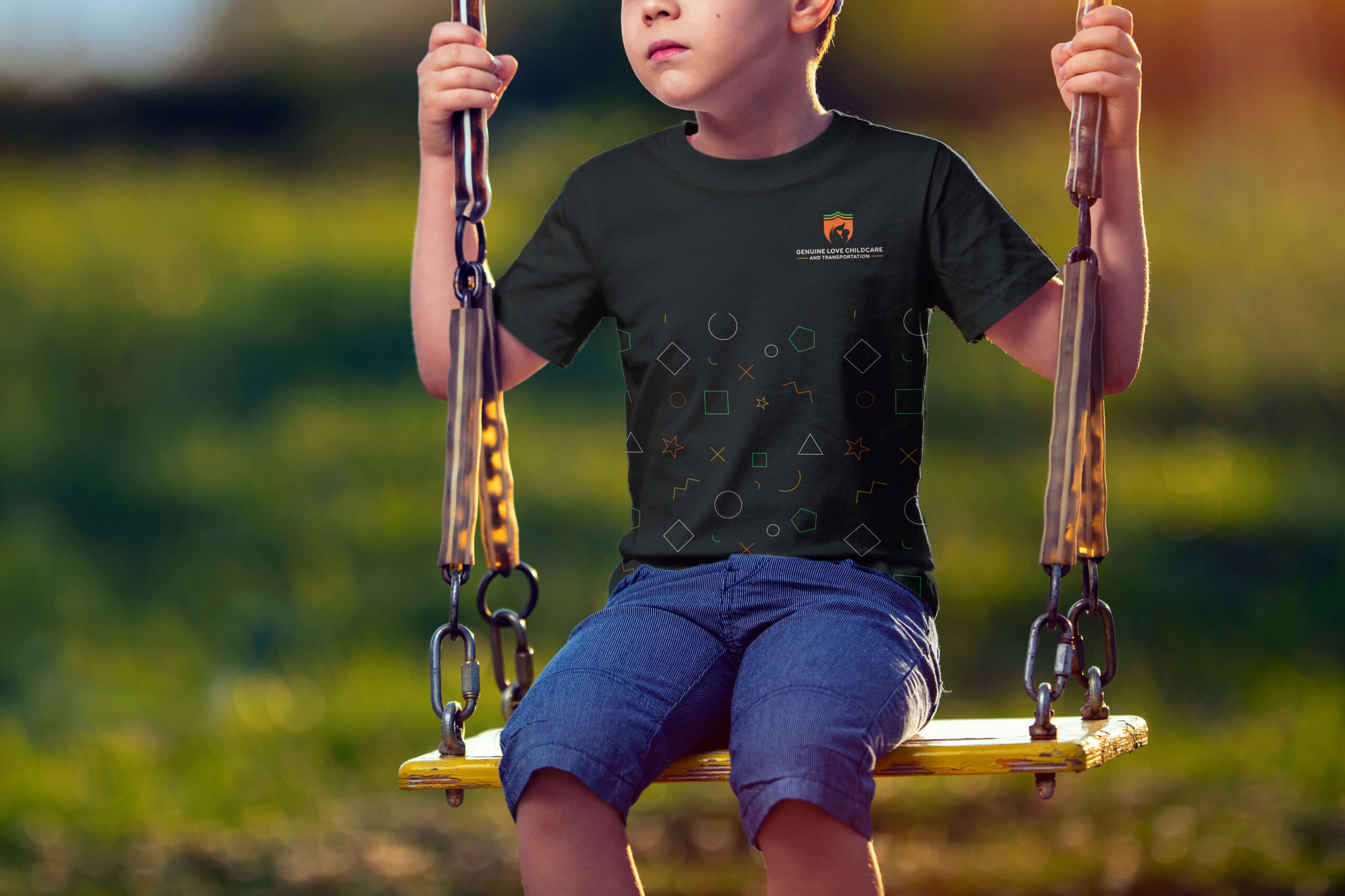
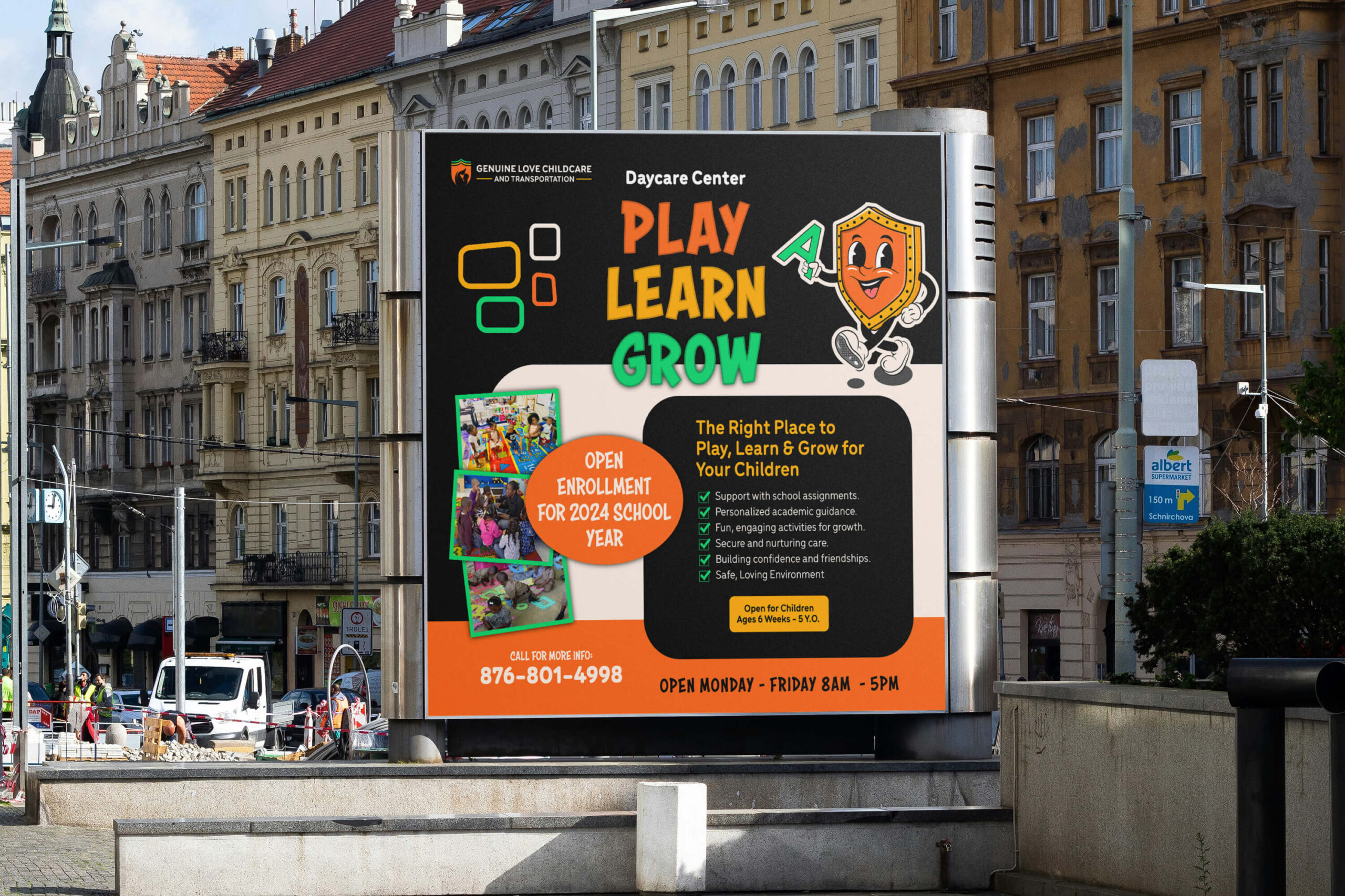
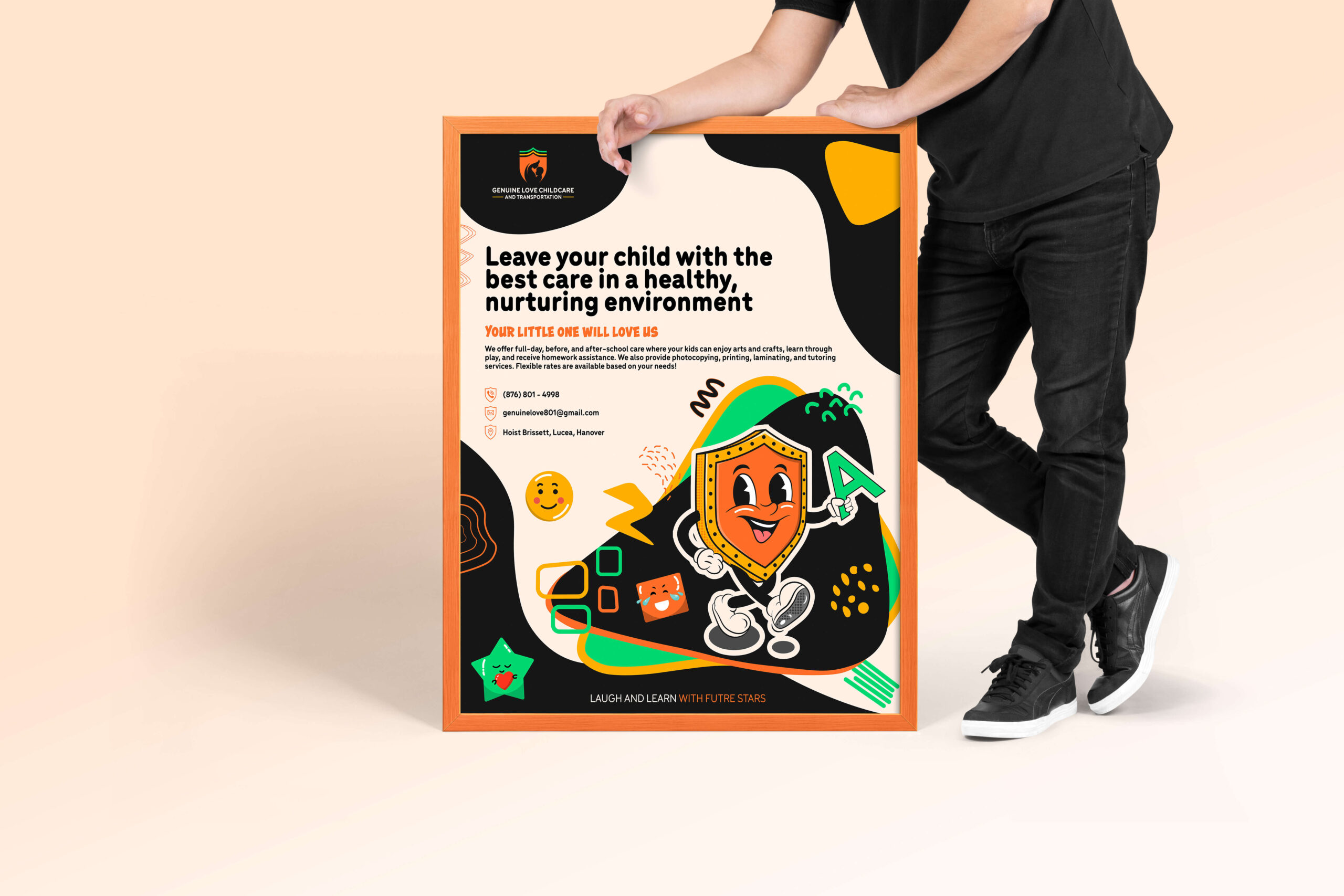
To further personalize the brand, I also designed a mascot—an advocate for the children, a playful figure they could relate to and interact with. The mascot was accompanied by custom emojis and a pattern featuring colorful, child-friendly shapes, adding an extra layer of fun and engagement to the brand’s identity.
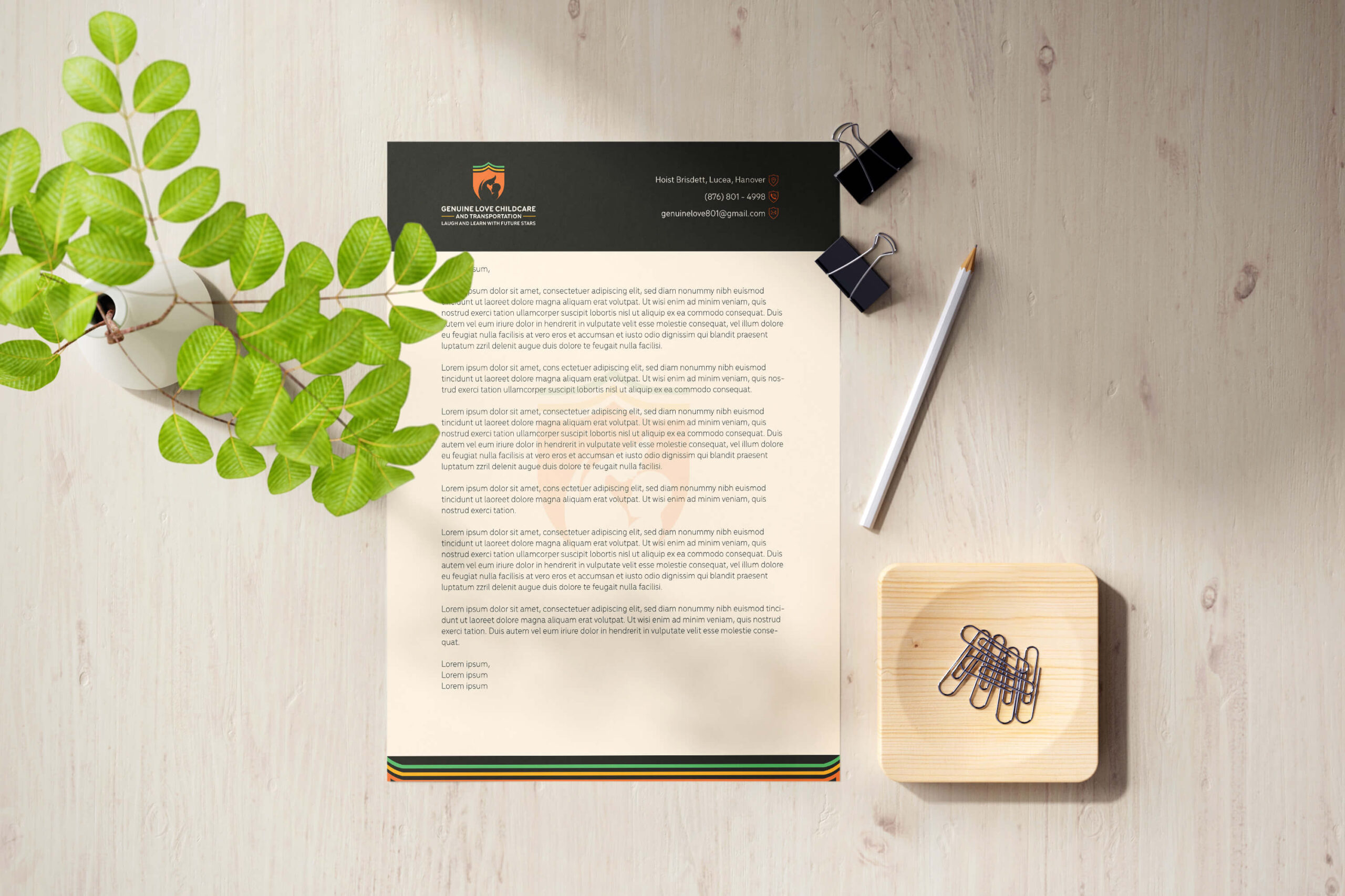
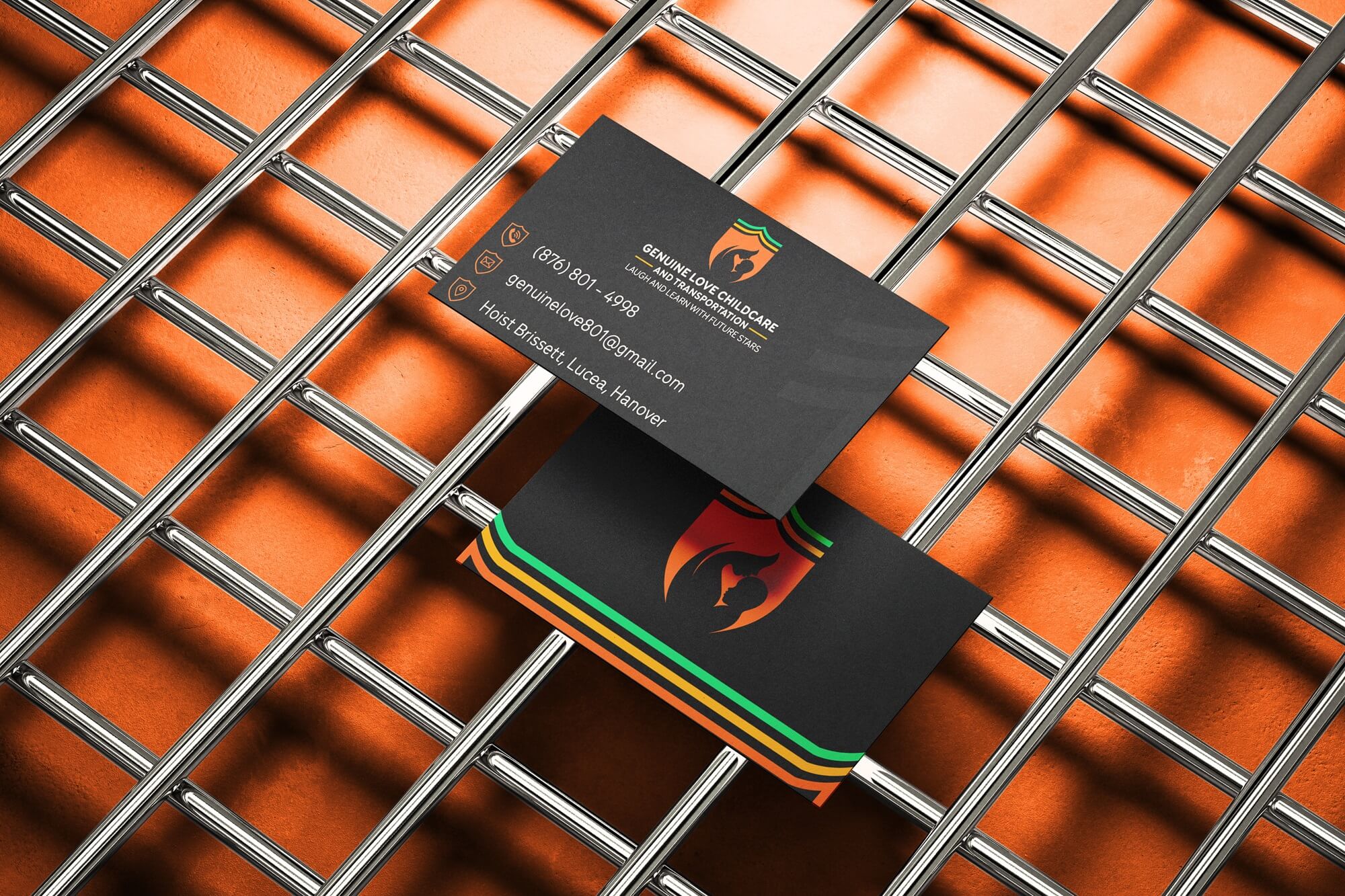
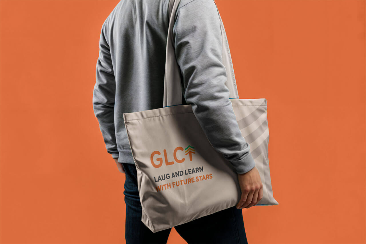
Creating the marketing collateral and stationery pieces was a particularly enjoyable aspect of the project. The client received a custom-designed letterhead and business cards that seamlessly aligned with the overall brand aesthetic, ensuring that every touchpoint felt cohesive and professional. The entire process was not only creative but also deeply satisfying, knowing that the final product would resonate with both children and parents alike.


TESTIMONIAL
This is my second experience working with you, and similar to the first, it was great. I am more than satisfied with the completed project. The work we’ve done together has started to improve the business. What really stood out was how professional and always on point you were, even when I asked questions about things right in front of me. My brand looks great now! My audience loves the colors, and they love the mascot you added. I would definitely recommend your services to others. I can’t sell anything, but I can give them my word as the brand speaks for itself.


