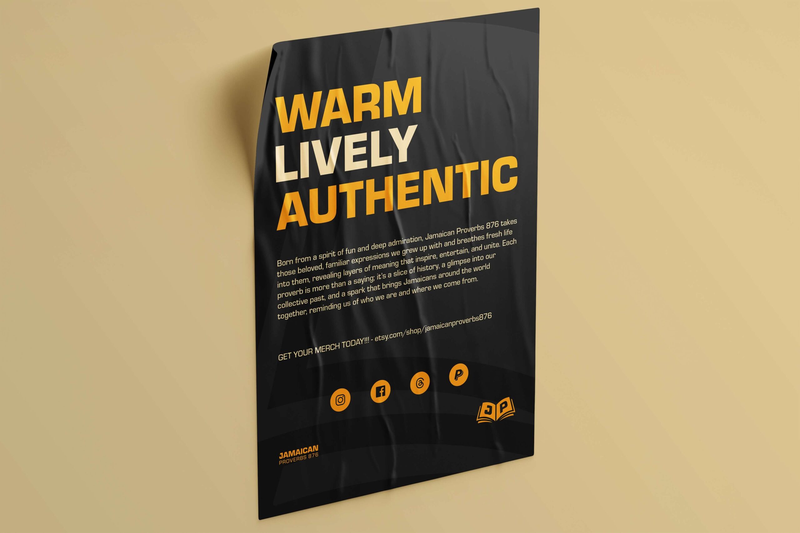
After reviewing the client’s brief, I immersed myself in research on Jamaican culture. Even as a Jamaican, I believe in going the extra mile to ensure every element is authentic and grounded. I gathered visual references—logos, illustrations, imagery, colors, and patterns—to build a mood board. This presentation helped finalize the creative direction the client envisioned for their brand.
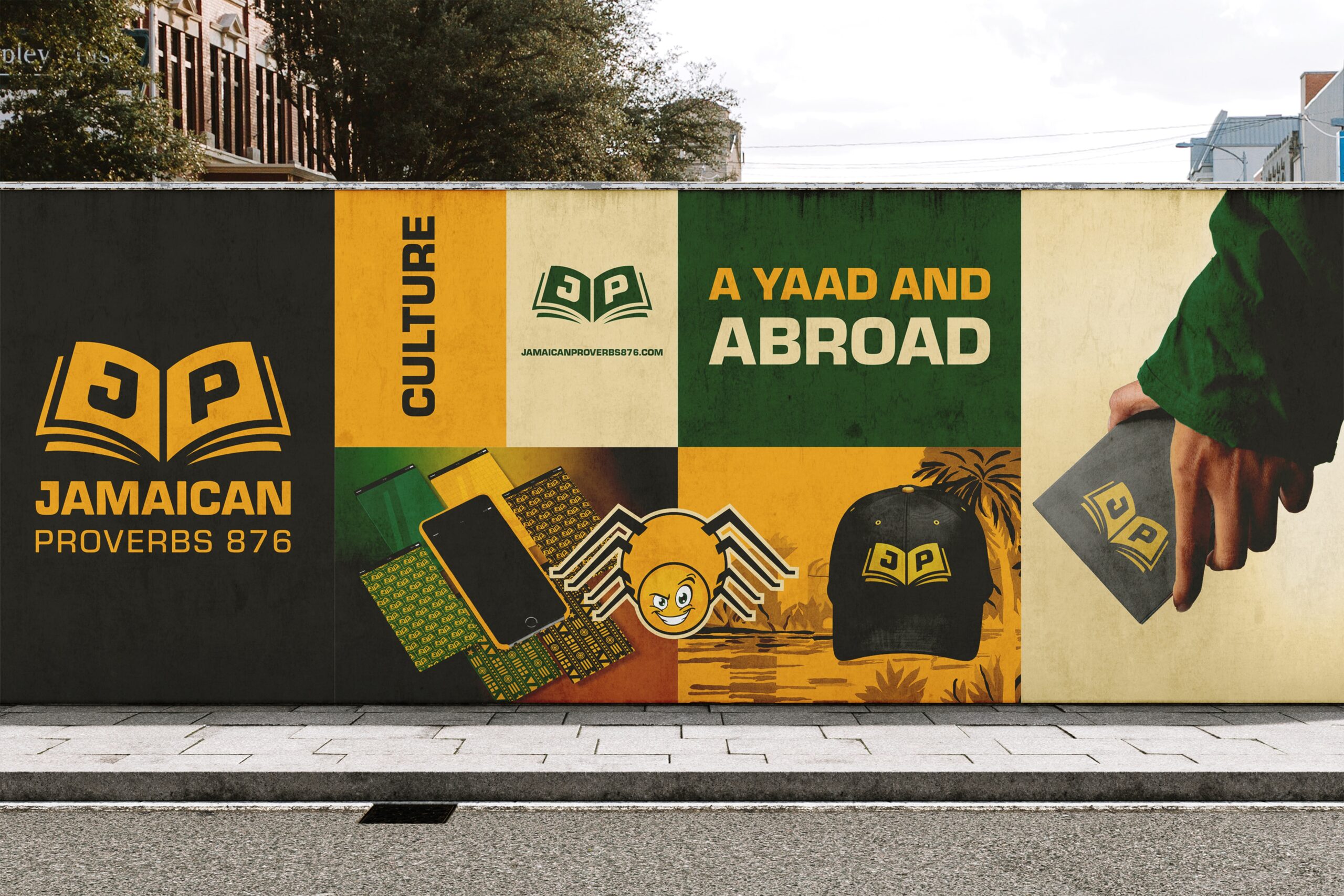
The client wanted a palette inspired by the Jamaican National Flag. My approach to color selection is systematic—I use two color wheels, one with bright tones and another with deeper shades. To strike the perfect balance, I blended choices from both. Yellow, already vibrant, became the centerpiece, supported by a rich green and a complementary red for cohesion. Black and white, subtly tinted with yellow, grounded the palette. To give the colors cultural resonance, I named them School Bus Yellow, Evagreen, Jamdung Black, Carmine, Ackee Yellow, and Pure White—each title echoing Jamaica’s creative spirit.
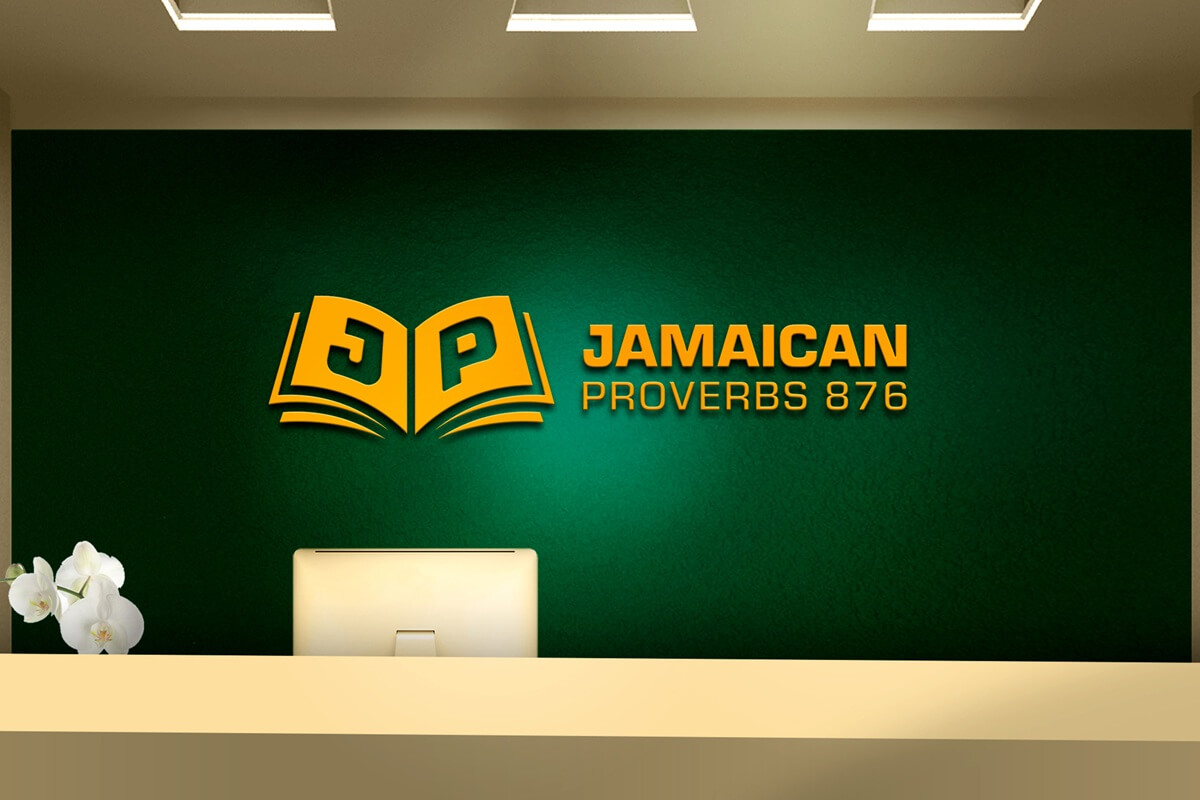
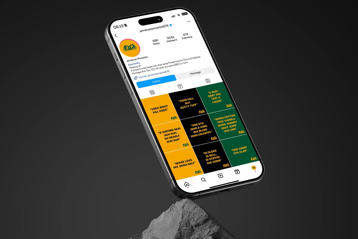
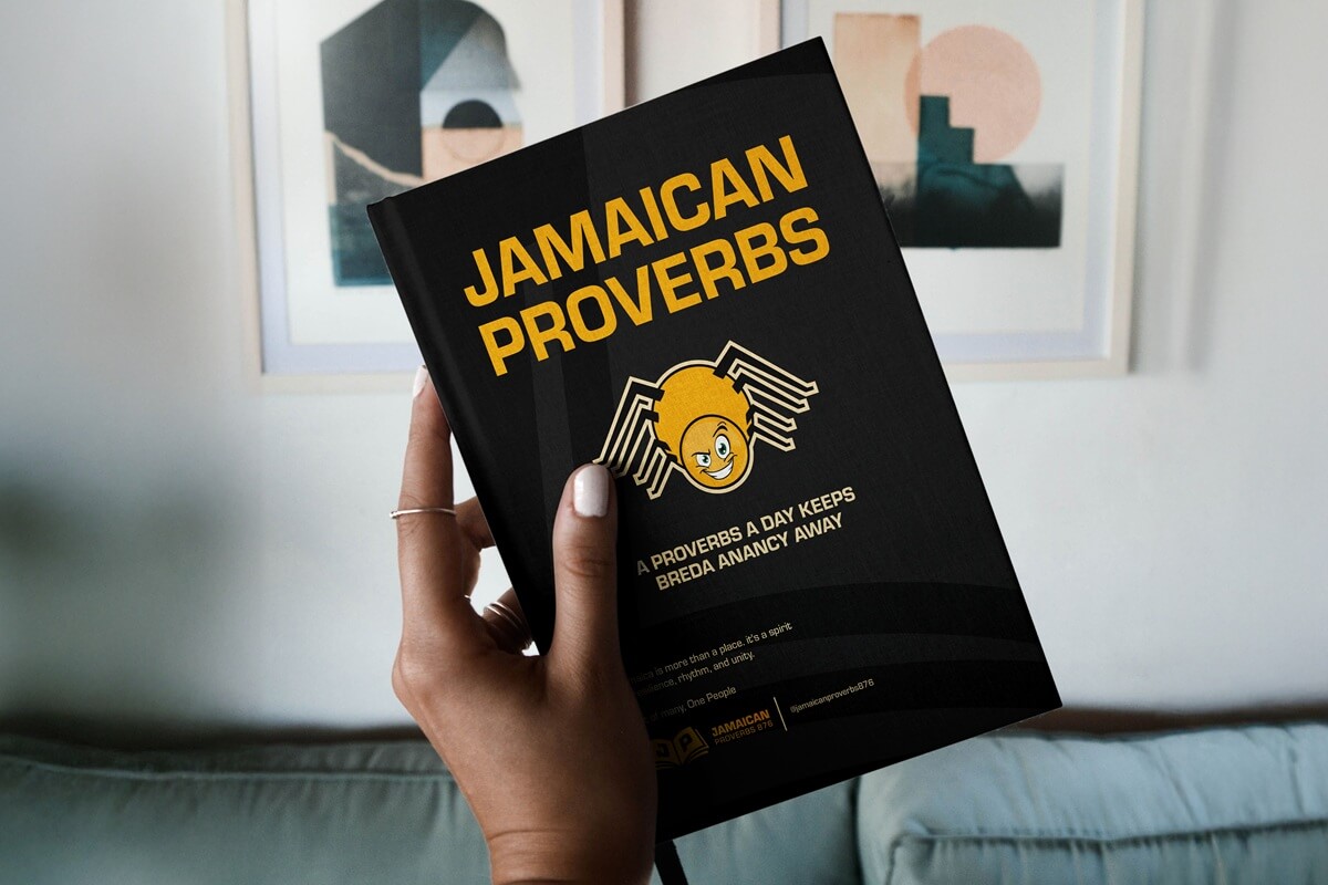
From the brief, I distilled a set of nine guiding words: Resonant, Nostalgic, Public, Long-lasting, Endurance, Relatable, Authentic, Traditional, and Cultural. Using these words as my compass, I began sketching concepts. After refining several drafts, I transitioned to digital tools, where the design took form. The final concept was a striking emblem resembling an open book—a nod to Jamaica’s rich history and the timeless wisdom preserved in proverbs. The initials “J” and “P” were integrated into the pages, symbolizing the brand name, Jamaican Proverbs. I intentionally left out “876” to maintain a clean and uncluttered design.
For the typeface, I selected Eurostile. Since its debut in the 1960s, this font has exemplified resilience and timelessness—qualities that mirror Jamaica’s enduring cultural legacy. Its clean, distinctive design ensures both readability and memorability, perfectly aligning with the brand’s vision.
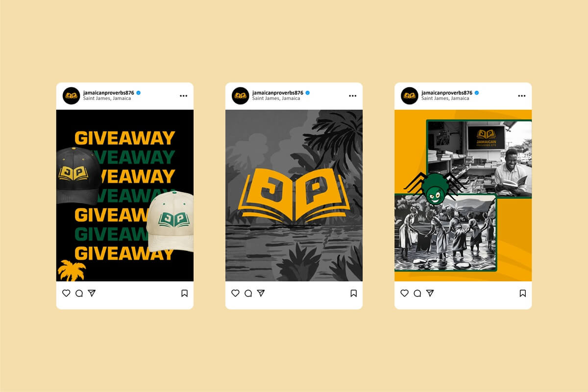
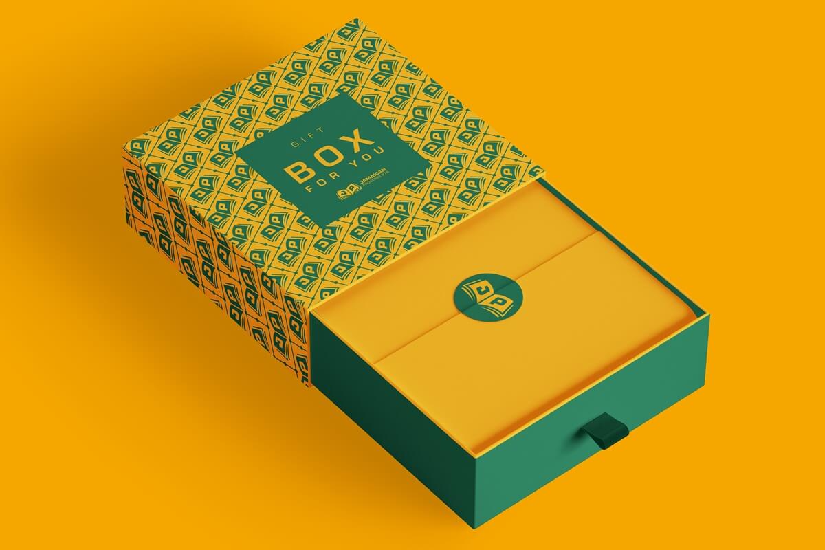
The client was thrilled with the logo concept. To complete the brand identity, I developed two unique patterns. The first combined the logomark with geometric lines and circles, resulting in a sophisticated design full of character. The second featured an arrangement of bold shapes, creating a dynamic yet harmonious pattern. These patterns will serve as key brand elements, particularly for merchandise and other applications, ensuring a strong and consistent visual presence.
For added flexibility, I proposed alternatives such as enlarging the logomark or incorporating custom gradients using the brand colors. These options allow for adaptability across various applications while maintaining brand integrity.
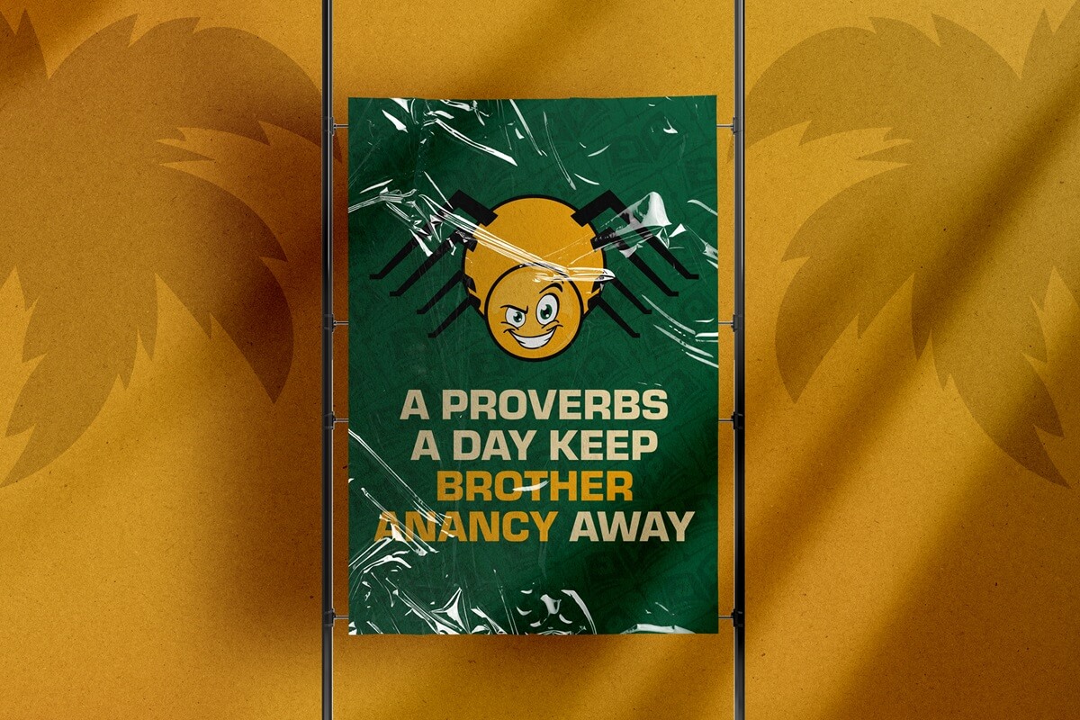
I also created illustrations that extended beyond aesthetics. Each piece was a purposeful celebration of Jamaica’s cultural heritage. From iconic national symbols to the playful mischief of Anancy, these visuals brought depth and storytelling to the brand, making it truly unique.